Like the rest of the world, I’ve been completely obsessed with the presidential election and nonstop news coverage. My drug of choice? Gabe Rivera’s Memeorandum, the political sister site of Techmeme, which constantly surfaces the most controversial stories being discussed by political bloggers.
While most political blogs are extremely partisan, their biases aren’t immediately obvious to outsiders like me. I wanted to see, at a glance, how conservative or liberal the blogs were without clicking through to every article.
With the help of del.icio.us founder Joshua Schachter, we used a recommendation algorithm to score every blog on Memeorandum based on their linking activity in the last three months. Then I wrote a Greasemonkey script to pull that information out of Google Spreadsheets, and colorize Memeorandum on-the-fly. Left-leaning blogs are blue and right-leaning blogs are red, with darker colors representing strong biases. Check out the screenshot below, and install the Greasemonkey script or standalone Firefox extension to try it yourself.
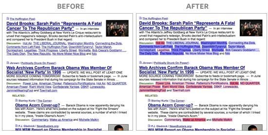
Note: The colors don’t necessarily represent each blogger’s personal views or biases. It’s a reflection of their linking activity. The algorithm looks at the stories that bloggers linked to before, relative to all other bloggers, and groups them accordingly. People that link to things that only conservatives find interesting will be classified as bright red, even if they are personally moderate or liberal, and vice-versa. The algorithm can’t read minds, so don’t be offended if you feel misrepresented. It’s only looking at the data.
For example, while Nate Silver of FiveThirtyEight may be a Democrat, he has a tendency to link to stories conservative bloggers are discussing slightly more often than liberal bloggers, so he’s shaded very slightly red. (Geeks can read on for more details about how this works.)
Install it!
Greasemonkey users: memeorandum_colors.user.js
Standalone Firefox Extension: memeorandumcolors.xpi
After it’s installed, go to any page on Memeorandum and wait a second for the coloring to appear. I hope you like it!
How It Works (Nerds Only)
The first challenge was getting the data. I emailed Gabe Rivera, and he graciously gave offered a full dump of every blog listed on Memeorandum. This didn’t include relationship data, showing which blogs linked to which stories, so Joshua and I crawled the site instead. Using the historical archives, we took a snapshot of the site’s homepage for every six hours for the last three months — about 360 total. With a Python script, Joshua scraped the links from the saved HTML to get the link data.
Armed with the spreadsheet of over 50,000 blogger-to-article relationships, we needed to somehow find correlations in the data. We used a method called Singular Value Decomposition (SVD), a method to break down complex data in matrices to its component parts. It’s extremely flexible, used in applications as diverse as weather prediction, movie recommendations, genome modeling, clustering search results, and image compression.
Inspired by GovTrack’s use of SVD to visualize the political spectrum for members of Congress, we attempted to do the same thing for political blogs.
Here’s how Joshua describes the methodology:
I created an adjacency matrix, with discussion sites as the rows and the discussed articles as the columns. When a site discusses an article on Memeorandum, we fill in a 1 in that cell; everything else is left as zero.
Every site becomes a very high dimensionality vector into link-space. This is very difficult to visualize. (Unless your monitor displays many dimensions. Mine only has two.) Since a bunch of sites tend to link to the same groups in the same way, we don’t need all those dimensions. So, very roughly, what SVD lets us do is reproject the points in space into a new coordinate system, so that the points that are similar are near each other and we know which dimensions are most important. We can take just the most significant ones.
We could use two or three for a nifty visualization, but we wanted to show the bias as a spectrum, which is just a single dimension. In this case, the second most significant dimension (v2) ends up corresponding to linking similarity. The first dimension (v1) corresponds to how much linking they do in general.
Curiously, when running the exact same analysis on Techmeme, the second most significant dimension ends up being Business vs. Technology. (The conservatives/liberals of the geek world?)
Did you get all that? If you’d like to try to figure out what the other dimensions represent, take a look at columns v3-v5 on the full spreadsheet below and let us know if you come up with anything. (We didn’t have much luck.)
Once we’d realized that the second dimension (v2) highly correlated with political leaning, we uploaded the spreadsheet into Google Spreadsheets and created a new column with a normalized score, scaled between a range of -1 and 1. The spreadsheet, with all of the sources and their respective scores, is below. (Download the Excel document or CSV if you want to sort or filter the data.)
After deriving the scores, writing the Greasemonkey was straightforward. Google offers XML feeds for Spreadsheets, so I queried this public feed of our data using XMLHttpRequest, parsed it, and colored it based on the score.
If you have any improvements to the code, please pass them on by emailing me or IMing me using my contact information at the top of the page.
Conclusion
I’d love to know what dedicated Memeorandum fans think of this. For me, it makes the site much easier to skim. At a glance, I can see what left-wing and right-wing bloggers each find interesting and, more importantly, when there’s an article that’s of genuine interest to both parties. It’s also interesting to quickly see which bloggers cross party lines, willing to link to stories that don’t favor their own candidates.
I hope you like it, and please contribute your changes to make it better!
Further Reading
Puffinware’s SVD tutorial is one of the most concise, coherent explanations of SVD I could find for the layman. Ilya Grigorik applied SVD to build a recommendation system in Ruby, with great explanations and source code. Simon Funk explains how he used SVD to tie for third in the Netflix Prize leaderboard (for a short time).
For those interested in network analysis of the political blogosphere, this 2005 academic paper by Lada Adamic and Natalie Glance looked at bloggers during the 2004 election. It’s two very separate worlds, as shown in this chart. Also, Microsoft Research’s Blews and Political Streams projects visualize bias and emotion for stories surfacing on political blogs.
This was my first Greasemonkey script, and I found Mark Pilgrim’s Dive into Greasemonkey invaluable. I highly recommend writing a couple scripts yourself; it’s incredibly empowering to modify other people’s websites.
A special thanks to Gabe Rivera for building Memeorandum and Techmeme and for supporting this little project.
Updates
October 10: J. Chris Anderson built a bookmarklet for use with non-Firefox browsers, or by anyone who just wants to test it out without installing an extension. This also has the benefit of working on sites beyond Memeorandum, like Google News. (Though, of course, it will only color sites that appear in our spreadsheet.)
October 11: Brendan O’Connor compared our unsupervised machine-derived rankings to human judgments of political bias on Skewz, and found there’s a significant correlation. He released the code and full dataset on his entry.
That’s fantastic. I blogged about it, but also have a question: could this be ported to other news sites? I’d love to see what it does to Google News. Such an interesting filter with which to understand the news. Thanks for creating it.
As long as you could extract a list of relationships between news sources and articles, sure. I suspect there are many more Google News sources than Techmeme, but it’s definitely possible.
Memeorandum is the first site I check every day. Your script makes it better. It’s interesting to see the linking bias of the mainstream (i.e., not primarily blogger) sources. Also, my eyes goes right for the stories with a mix of blue and red. Kudos, Andy.
Very cool. I’d like to see this approach generalized. Your Techmeme example is exciting. Ohhh, the days of having time to do this sort of thing. I really must make time.
I wonder what SVD would bring out about people’s @twitter linking habits.
Nice algorithm you got there! A great bit of functionality for what is one of my several-times-a-day stops. As you note, there is some limitation to using linking activity as a sole metric, but it makes for an interesting bit of infovis nonetheless. Electicker does group blogs by political affiliation (referring to them with affectionate snark as “moonbats” and “wingnuts”), a factor that along with some of its other organization quirks (daily polls at the top, for example) has been pushing to the top of my ‘need to catch the quick electoral new of the day’ stack.
So very cool. Thanks for taking the time to write up the “How It Works,” too. Fascinating!
I would love to see this in Techmeme as you describe (the business vs tech divide).
The problem is not applying the technique (although it gets slower rapidly as the matrix gets larger.) The problem is that it can be hard to understand what you end up measuring. It’s sortof easier to cluster things than to classify them this way, but in this case, political leanings are an easy and obvious clustering.
One important thing to note here is that these estimated parameters are the result of “unsupervised” learning. We never told the system that some are liberal and some are conservative or whatever; it figured it out on its own. A more powerful system could come out of using external knowledge about the classifications of the blogs. But that would be harder.
There are, however, many other techniques we could have used. Some of them are probably a lot better. I’m lazy.
Edward: I’m happy to post the data. But what colors would you use? Also, it’s somewhat less surprising that gizmodo is about gadgets and techcrunch is about business…
Here’s the techmeme analysis.
http://spreadsheets.google.com/ccc?key=pjO-sJn7vs6Cde5AwEZNfBQ
v2 is the “spectrum” equivalent.
Gspread doesn’t let viewers sort? Sigh.
Very clever and helpful. Good job.
I have a few observations, however:
(1) Virtually everybody is at 0.00 in your column V2. I don’t know if you have some hidden decimal points in there, but even so, the algorithm does not discriminate most blogs by very much. The spectrum is too compact, and too bunched around the middle; the ends are well-separated, but this accounts for only a small fraction of the data. (I realize this could, by itself, be telling us something important about the Memeorandum blogosphere – i.e., that it is fairly well-balanced – but you lose the opportunity to pick out interesting relationships by not making finer distinctions.)
(2) The link-similarity calculation tracks with left/right leanings only moderately well. I suspect this is because many blogs tend to link to other blogs across the spectrum, to either praise or criticise – linking to many liberal blogs does not mean you are a liberal, and vice versa; similarly for conservative blogs. At any rate, you have WhiteHouse.gov, Ben Smith, and the Wall Street Journal all well over on the liberal end of the spectrum, and the New Republic on the conservative side. (I still can’t tell if the big 0.00 middle ground is ranked spectrum-wise, or just randomly. If the former, there are some odd relative rankings within that group, to say the least.)
(3) Memorandum by default codes its unvisited links as blue and its visited links as purplish-red. Have you found a way to make this distinction without using the color codes? I would not want to lose the ability to quickly tell which links I have visited (it also provides a quick check on how rapidly the stories have been updating, as the links change color – many blue links means many new stories or commentaries).
Keep up the good work!
Keith, good points.
Unfortunately, the numbers have no real meaning; it’s not like they’re measuring units of conservativeness. Lots of the numbers end up smallish, mostly due to the constants I chose to start with. Sadly, Gspreadsheet format small numbers this way.
The numbers are less about a score and more about position – the items end up “near” items that are similar, is all. Whitehouse and New Republic probably don’t link to many blogs; I’m not sure how Memeorandum connects these items. But it’s not the same metric on which other things are measured, so this is not surprising.
I am tempted to rebuild this using a raw crawl of the actual sites. But that seems like a lot of work.
This is really cool. A lot of the blogs in the v2 column have a value of 0.0. Does this mean that those blogs don’t have a color?
bodegax:
No, just smaller numbers than the formatting allows
So, Dimension 1 is a spectrum from, far left: “links to a lot of stuff” to far right: “links to not very much stuff”
And dimension 2 is far left: “links to absolutely nothing that far right links to” and far right: “links to absolutely nothing that far left links to” right?
So the key value here in trying to examine an interesting spectrum is to find a pool of participants (blogs, news sites, etc.) that, subject-wise, *should* be linking to the same external sites. It is the times that these sites are *not* linking to the same external sites that then becomes interesting and shows an outside-of-subject-matter difference.
If you pick a selection that is too different, say a random 1000 sampling of all news sources and blogs on any subject, the spectrum will only be based on the subject matter being completely different, which will happen widely for a variety of reason (ie, there’s likely very little overlap between sports blogs, cute-animal blogs, news blogs, and porn blogs, but that’s not an interesting spectrum).
Pretty cool example of what Greasemonkey can do. It sounds like the bulk of the work was getting the data right, but way cool bringing that data right to the spot where it’s useful.
bodegax: I fixed the number formatting, sorry about that. Note that I don’t show a color when the score is too close to zero, since they’re too close to call.
Kevin Keith: I’m not modifying the link color, so you should still be able to tell which sites you’ve visited. (I don’t think the background colors are too distracting, but you can change them in the Greasemonkey script, if you don’t like them.)
here is a partial visualziation of v1, v2, and v3 with some points labeled.
http://www.flickr.com/photos/joshu/2929983192/
v1 governs the intensity of the dots. it is the most “important” vector.
v2 is on the x axis, left to right. it is roughly the spectrum.
v3 is on the y axis, up and down. Any thoughts what v3 might mean?
i’ve distorted the data to spread out the points. the labeled items are chosen very arbitrarily by hand so that they don’t overlap.
Could you run this analysis in reverse? In other words, could you analyze the stories that were linked to by all of these blogs and determine which stories pushed the blogs further along their spectrum?
It seems like there could be an index of divisiveness created for the links. Potentially this would be some combination of an extremely one-sided story with a fairly popular or at least well-passed-around blog.
Yes, I also have the parameters for the stories themselves. Since there is much less data per link (very little history) it’s less interesting.
I’m a pinko! How interesting that several MSM sites (Time, Time’s Swampland, WaPo, The Caucus, CNN) are way over on the deep blue side. While it probably doesn’t apply to almost anyone else, sometimes if I don’t want to link to a site even with a nofollow tag I just provide a bare link. However, one thing the chart leaves off is that some people may use nofollow tags for sites they consider unfriendly while leaving them off for those they don’t mind giving a link to.
24aheaddotcom: Yes, I just counted when memeorandum says something linked to something else, without crawling the sites themselves. I am tempted to actually do the crawl.
Dave: BTW, v1 goes from zero to very negative, as it happens.
This is awesome, and the source code for that GM script looks slick. Nice work!
I see a glaring error here. No Quarter isn’t right-wing. At all. That site belongs to a Hillary Clinton supporter so he’s currently skewering Barack, but believe me – he’s no right-winger.
(I didn’t read earlier comments. Sorry if this was mentioned already.)
Not particularly insightful, but I assume if you threw all the MLB blogs in there, I bet this would naturally divide them up by league and likely (more subtly) by division. It’d be interesting to see some sort of line graph of the distinctiveness over time, with everything merging post-season.
Dave, great idea. I can analyze http://www.wesmirch.com/ and http://www.ballbug.com/ too, since they are in very similar format?
I can also do time-based analysis easily enough.
WOW! As a hardcore Memeorandum junkie, this is the best thing since sliced bread. It saves me a ton of time when I go through the links on the site. Kudos to you for such a great utility!!
I’ve created a bookmarklet works like the Firefox scripts, but in other browsers as well. It also works on all A tags, so it does the job on most any politics related link page.
Really good idea! Maybe the bookmarklet is in order for tech sites. Next step – tech myself how to apply the SVD technique to other datasets.
Great job! We’re doing something related at Cruxlux, which we recently launched and might be interesting to you. It can be used to search any current topic and gives back a map with content (both blog posts and video) laid out by perspective.
For example, take a look at http://www.cruxlux.com/q/Obama (a search for “Obama”). You can see that dailykos.com and other progressive content kind of clumps together, with conservative views a bit a way, and nonpolitical sources farther away still. (Note the coloring is just to guide the eye about changes in perspective, not red=conservative, blue=liberal.)
The search engine also works for nonpolitical queries, and you can also focus the results on videos/blogs of a particular view if you want.
Obviously, there are things to improve, but hope you find it interesting!
I love this! I used to have to filter quite madly in my mind each story for extreme-views (via sites) on each linked story. The “shading colors” will at least trim-out the maddening prospects of reading whack-jobs.
Dave, I’ve run the analysis. v2 turns out to be Yankeeness. v3 appears to be Red Soxness? Here’s the data.
“Drug of choice,” indeed. Memeorandum never fails to raise my blood pressure, yet I must … reload … one … more … time …
🙂
Anyway, thanks for this. Clever idea!
I would like to see the same algorithm applied to the originating post.
I have been maintaining for at least a month that Meme has gone from being reasonably balanced to being dominated by left news sources and blogs fighting aggressively for Obama.
Virginia: I tried to do this but the data is very noisy, unfortunately.
Andy: That’s awesome. It makes Memeorandum so much more useful.
Guha: Very cool. Will check out Cruxlux some more.
Fun project!
Once we’d realized that the second dimension (v2) highly correlated with political leaning
How exactly did this happen? Did you apply your judgment to spot the correlation? I’m a bit puzzled because I don’t see how exactly the data was seeded. In other words, how did you first educate the system on the concepts of “red” and “blue”?
No, we looked at the items at each magnitude and just noted that they all went together. This was Andy’s fundamental assumption although actually he’d guessed that different sides tend to refer to different sources, and this was not as good a signal. When we switched to the specific articles, it worked MUCH better.
If it didn’t happen to work out that blogs of similar leaning linked similarly, then v2 would have been some other factor. This is the problem with SVD.
The ONLY input was the set of links. A long list of Site -> Article, Site -> Article, etc.
Like I said, the system thinks the MOST important statistical dimension is how much they link in general. Political bias is lower importance to it.
Dear Joshua
Sorry if I’m dense but if you can rate the top 19 sources on your list above as blue when they are commenters to posts, why can’t you do the same when they are the originators of posts?
I don’t know how Meme (my formerly affectionate nickname) selects its headline posts but I do know (because I’ve been keeping track) that since about the beginning of August Meme has become overwhelmingly anti-Palin/McCain pro Obama.
And I’m sorry because Meme was my most trusted news aggregator. Now I’m searching for a less biased source.
I’ve had to remove a couple nasty comments, so I’ll be clear:
Personal insults and irrelevant, inflammatory comments about the election (from either political party) will be removed, especially if they’re posted anonymously.
This is damaging.
Being able to winnow out or select the stories should be a matter of subject and content, not coding of the source.
It stops thinking. I stops the need to reason through blogs of interest.
Nice thought, not a good end result.
You never “consider the source” before reading? Taking the potential biases, preconceptions, or conflicts of interest of a news outlet into account when reading an article is a very good thing.
All this extension does is annotate their past linking behavior. Whether you decide to ignore it or read on is up to you.
you lost me at ****adjacency matrix****
I am extremely right wing and Hot air is my favorite blog, although it too suffers from PC censorship. I’ve been banned once for not towing the PC line with respect to a Flemish political party. But I must say, the Hotair readership, if not the craven moderator, is very happy with this rating. And since I am the most right wing on that blog, that makes me the most right wing commentator in the blogosphere, according to your algorithm, so I consider your calculus recognition for a job well done.
JJ: yes. absolutely. As people get more entrenched in a position, the tend to accept only evidence that strengthens their position and ignore evidence that refutes it. This is called Confirmation bias.
On the other hand, the coloration serves as a sort of reputation around how the blogs have actually behaved in the past. It’s not like we are deciding how to label them by hand, or whatever (aside from the color choice itself.)
You seem to have recreating Skewz.com without the user voting
http://www.skewz.com/
There is one major problem with this algorithm.
A blog like mine (copiousdissent.blogspot.com) and Newsbusters that links to left-wing articles, to point out their absurdity, shows up as a Left-leaning blog.
Trust me, I don’t know how further to the Right I can get on economic issues, and that is what I write about.
Other than that…this is really well done.
Thanks, Andy, Joshua… I appreciate that you’re mining and refactoring existing public info in this kind of way.
I’m not able to use Firefox on this Nokia Internet Tablet (a Flash implementation would be more widely accessible 😉 so I’m not able to play with it yet. But I’m wondering… wouldn’t this type of display be just as useful for showing cocooning? A weblog which only links to one flavor of thought would usually be less useful to me than a blog which really listens to a diversity of opinions. The less-colored ones seem to be more likely to be more open-minded, true…?
Other than that, if we could visually see which weblogs really make a case and which just namecall the heretics, or which just snip bodytext found elsewhere for their own proprietary ad revenue, these would be a helpful addition to Gabe’s pioneering contributions as well. I don’t see a way to readily implement these though…. 🙁
tx, jd/adobe
After a full day of using this, I just wanted to drop by and say…I love you guys! this is really awesome!
HotAir is the most right-wing blog you studied? Huh?
Your methodology needs some serious tweaking.
I know this is a difficult concept to grasp, but the scores don’t represent each blogger’s political views — it’s a reflection of their linking activity.
In the case of Hot Air, their linking activity was the most different from everyone else. Different in what way? We don’t know exactly.
The algorithm is unsupervised machine learning, looking for correlations in the data. All we know is that, generally, this dimension tends to line up roughly with political leaning.
I wouldn’t obsess over the ranking.
Fair enough.
Thanks for the terrific works, folks.
Gary D, thanks for pointing out Skewz. I’ve seen it before and am a fan.
It’s an interesting question whether these scores mean anything. So I got the Skewz data and checked to see if your SVD v2 correlates to their users’ judgments of bias. It does! The algorithm is real! 🙂
Writeup here. I’d love to hear any feedback: http://anyall.org/blog/2008/10/it-is-accurate-to-determine-a-blogs-bias-by-what-it-links-to/
Anybody find it interesting that TIME.COM falls into the most left-leaning category?
No, I didn’t think so – old news, I suppose.
Nonetheless, an interesting tool.
HobbesDFW:
Sometimes memeorandum uses something other than an actual link to measure the connection between discussing sites — I do not know how it works.
Media like Time do not link other sites in the same way that blogs do.
Since my algorithm uses linking behavior, and because it just trusts Memeorandum when it says two sites are linked, and because they aren’t actually linked in the same way, I think the results can be spurious for those sites.
So sites like whitehouse.gov, nytimes.com, time.com, and so on get weak results by using this methodology, unfortunately. I will think about extending the experiment.
Remember that this is just a statistical approximation. It’s like we’re forcing everyone to move to a new house on a town with just one long street, so that they are neighbors with people “like” them. It’s going to be rough at best.
Does that make any sense?
Brendan: Nice analysis. Any chance you could put an r-squared in there?
HobbesDFW: Also, in this case, “Time.com” refers to Mark Halperin’s online column called The Page.
There are several basic gaps in logic built into this operation.
1) memeorandum (M) does not record every post that links to an article.
2) M sometimes lines up a post under an article that the post does not in fact link to.
3) M lines a post up under no more than a single article, so that when a post links to multiple articles then your method takes account of only a single one of the links.
4) Some bloggers generally write only short posts linking to a single article, whereas others generally synthesize a lot of material in their posts. Taken with point no. 3, that means you’re not measuring what you think you are.
5) M gives prominence to only a narrow range of political stories and issues. Some blogs that show up at M also do original reporting or comment on traditional media stories that never are featured at M. That entire side of a blog’s output is ignored in your grading of its linking patterns.
6) The posts at a few blogs are frequently featured at M, while other blogs are never featured. That distorts what you’re measuring. For example, it emphasizes the linking patterns of blogs that read and link to those featured blogs or to the articles the featured blogs link to.
All in all, I’m not sure what you’re trying to measure much less that it’s possible to use the system you’re employing to measure anything very useful or meaningful.
In addition to all that, there are some phenomena of blogtopia that your attempts to quantify linking patterns are impaled upon. Most obviously there’s this: right-wing blogs frequently are obsessed with factually false allegations or meaningless distractions that any reasonable person can see right through – sometimes for weeks at a time, long after the bases for the stories have been shredded. They also give credence to pundits and journalists who are known to be serial fabricators or who otherwise have lost all credibility. It’s just one way in which these blogs are highly insular. It could be argued that your methods here are actually best able to measure just how isolated a right-wing blog is from the predominant news stories of the day whose importance centrist and liberal bloggers as well as journalists of all stripes recognize. There’s a substantial difference between news stories one might reasonably care to write about but doesn’t, and transparent nonsense that’s going to be dismissed by everybody but the rabid partisans. Similar things occasionally and briefly pop up among extreme left wingers, but not remotely as often or for as long, nor do they spread as an article of faith throughout the left.
Joshua, I put the R^2 as a comment on the post.
A nifty tool, but I don’t see how it enables your desire to “see, at a glance, how conservative or liberal the blogs were without clicking through to every article,” as you stated in your intention for it. It doesn’t provide that level of contextual insight into a blogger’s intent.
All this does is highlight whatever the blogger is discussing. Given the spectrum of writing styles you’re trying to examine, you’re lumping True Believers (who link only to sources they approve of) in with Intellectuals (who link to anything that provides a source they’ve cited, on either side of an issue). Linking behavior differs greatly. True believers are not anxious for their readers to see differing points of view. Genuine intellectuals (who have any degree of factual integrity) will trust a discerning reader to see what the opposition is saying — for themselves.
I accept that this tool will color links by their purported bias, but I disagree that this indicates whether the blog in question can be characterized as such.
Moeskido: I think that True Believers are rather more likely to be farther from the center, so yes.
Like we said, this is just one estimator. We’re boiling down one rather complicated position into a single number, for the purposes of display.
Can you figure out what v3 might correspond to? There’s almost certainly something meaningful there as well. In the baseball example, v2 correlated to yankees-ness and v3 correlated to sox-ness…
Joshua: I’m not a statistician, just a user. I don’t claim to possess any skill that can quantify a writer’s point of view unless I can observe that writer’s particular style by reading their actual posts. There are bloggers who argue their points with circular dogma, and there are those who present ideas which they substantiate with evidence. Are those two behaviors quantifiable, or is this spectrum more complex than that?
Moeskido: I restricted my analysis to data that was available from Memeorandum itself; when an article was said to link to another, etc. This analysis is a quantification of these details, and like I said, necessarily a simplification.
I imagine that anything that can be measured or quantified can be summarized. So if you or someone could come up with textual features that typify circular dogma or substantive arguments, then I am sure they could be represented.
Again, I did something very simplistic. To me, the fascinating part is that something approximating political bias emerged as a statistical factor — without having to tell the system ANYTHING about what we were looking for.
Andy Baio,
JJ’s claim has a lot of merit. Methods of identifying bias do get a lot of use as an excuse to ignore people. See, eg, overcoming bias. The script is not flexible though–it labels everything, rather than letting people notice their opponents’ bias and ignore their own.
smintheus/Moeskido: I totally acknowledge all those flaws. That said, as you can see in using the script, it managed to categorize most blogs well enough to make the script useful. And Brendan O’Connor’s analysis shows that our algorithm lines up with human categorization of the same sites, so I’m pretty happy with it.
Douglas Knight: I’m not sure what to tell you. Your argument, as far as I can tell, isn’t that our methodology is flawed, but that the mere attempt to identify bias is damaging. In that case, I can only say that this script isn’t for you. We’ll have to agree to disagree.
But for me, it’s a fun and useful visualization. I don’t see the harm.
Interesting stuff. Can you post an interpretation for those of us who do understand the math? That, in the SVD A D B of your matrix M, how do you interpret A, D, and B? For example, do the first two vectors in B (or A) point to liberal space and conservative space?
For what it’s worth, if I were you I would try normalizing the number of total links from each site. That may make the second number a more reliable estimate of ideology. (Actually, this is easy to do post hoc: I think you just divide the second number by the first. This brings down Time’s relative bias considerably.)
The links that Andy included actually have pretty good examples here.
The first column of A is “v1” and the second column is “v2”, which was the underlying number for the “score” that Andy generates.
Okay, let me try to answer my own question.
Let M_ij be the number of times website i links to website j. The SVT decomposition of M is
M = ASB, where A and B are unitary and S is diagonal. The matrices A and B are also the matrices of eigenvectors of M^t M and M^t M, respectively.
But M^t M is just the matrix of scalar products of the columns of M, and M M^t is the matrix of scalar products of M’s rows. In other words, (MM^t)_ij is the overlap of the vector of sites linked to by site i with the vector of sites linked to by site j. Likewise (M^t M)_ij is the overlap of sites linking to i with sites linking to j.
These two matrices having different meanings, it would help to clarify which set of eigenvectors is being tabulated.
Google search reveals that Markov chains are also used in this context. In this point of view the adjacency should be normalized so that its rows sum to one. As far as I can tell (and in contradiction with what I said earlier), no SVT properties of adjacency matrix are left invariant under Markov normalization. But it does seem that if you want to measure a site’s bias you’d first want to normalize its total linking.
i don’t need this. i know the bias of every blog by just looking at the name.
Well, I guess it’s not for you. There are 1,380 sources in that spreadsheet, and I personally can’t gauge based on names alone. “JammieWearingFool,” “Pandagon,” “Protein Wisdom,” “Jed Report,” and “Taylor Marsh” don’t tell me anything about their biases.
And even if I did know all of them, the script gives me an immediate impression of the context without reading every source’s name. If I see a sea of red or blue, or a mix of both, that tells me something about the article being discussed.
The output vectors already end up being orthonormal. v2 should not contain any of the data v1 does; they are orthogonal.
I can add the total link count to the spreadsheet so you can see what normalizing by that looks like, if you want.
Hi Guys,
Nifty tool. However, it is broken right now. Does not show any colors. Probably due to the spreadsheet link not working.
Amit
It works for me… Are you running the latest version?
Thanks for this, Andy; I was getting tired of thinking for myself.
Nice analysis and use of GreaseMonkey!
Performance Suggestions:
Smaller data file: Data source file is 800K+ which is HUGE for the non-broadband world. If my math is correct, about 90% of the entries in the source file result in no color effect (less than 5% “bias”), so are irrelevant as far as the script is concerned.
Include data in a more static way: I don’t think the biases are shifting that frequently, so having the latest data available for every script run is not necessary. Maybe including the data directly in the script is sufficient for most people?
Erik: It’s being compressed with gzip behind the scenes, so the actual file being sent is much smaller. That said, you’re right. Including the unmarked data is inefficient, but if I remove it from the file, it’s no longer available for other people to reuse. (For example, some might choose to change the color scoring in the script.)
We considered including the data in the script, but then people would need to download new versions of the script periodically as data changes or if we found errors after release. I figured that was worth the performance hit.
Sorry, I overlooked the gzip stuff in the code–that will make quite a difference.
You might also want to consider adding the script to userscripts.org.
There must be a better way of doing this than with SVD. As many of these comments point out, the dimensions extracted by SVD are defined to lower variance, not pull out coherent topics.
For instance, a multinomial mixture model with two categories would take care of the size issue you’re seeing with your first dimension in SVD.
Something like latent Dirichlet allocation (LDA) might work, and it has the added benefit of probabilistic output in terms of percentage of red/blue links and also a posterior interval around the estimate itself. LDA generalized probabilistic LSA, which is the multinomial form of SVD.
The other advantage of a Bayesian method like LDA is that you can add as much or as little supervision as you like. I’d bet that with as few as 10 or 20 blogs as seeds on either side, you’d do a much better job of inferring the split for the rest.
The method you’re using is supervised at least in the sense that a supervisor decides which dimensions of the decomposition mean “conservative” and which mean “liberal”.
This can all be done from the text point of view, too. Jaime Carbonell built a generator as part of his thesis back in ’79 and there’s been lots of work on text classification by left/right leaning.
You can also use SVD or LDA on the text directly or build a joint model that uses both text and links for inference.
Timely Development has a nice page on SVD for Netflix with a from-scratch scalable implementation in C.
We implement both LDA and SVD as part of LingPipe, and both have tutorials on their use for text (LDA is part of clustering, whereas SVD has its own tutorial): http://alias-i.com/lingpipe.
I’ll offer a simple generalization idea that may help fix some of the flaws (and create others).
It’s basically an idea I had a couple of years back but never really knew how to implement.
you separate the rating part from the coloring part,
i.e.
make a site that lets people rate things (companies is the best example) by different criteria,
add a simple addon that ‘colors the world’ by a criteria,
and let each user choose which rating lists he wants to use and where (in which sites).
[My design was intended for ‘letting people live more by their values’ (social, environmental awareness),
so you select someone you count on that rates how green companies are (lets say greenpeace),
add another (amnesty) for human rights, animal rights, …
adjust how much each of them is important to you,
and at the end you get a ‘world coloring’ by how much the company fits your values.
(the basic design was by adding unintrusive ‘little red circles’ with colors ranging from red to green, so everywhere you surf nike’s accompanied with a little red circle cause they abuse people in china, new balance is yellow…)]
But it works for anything, one-click selection of coloring schemes that hide in them knowledgeable data about stuff (ideally one’ll be able to click the colored circle and get an explanation for the rating at the different rater sites that come into play).
One day you can color politician names by their expenses bill, another day companies by six degrees from china (if your pro-tibet), another, different products by their carbon footprint.
The whole idea is based on the willingness of people to actually rate stuff,
but it’ll be open to anyone (a ‘free market’ of ratings), searchable, and hopefully’ll build itself up.
Here, for example, if someone really wanted to, he could add his own rating of sites by their bias, and his friendswhoever finds it coherent and trustworthy’ll use it, that in addition to the automatic coloring option.
thoughts?
Hi Andy,
Interestingly, it does not work from home, but does at work (Both places are running FF 2.x on Linux)
I will upgrade later today.
As I use it, I find it to be a good filter.
Also a suggestion, it might be worthwhile to color the main article kicking off the discussion.
Regards
Amit
This sounds awesome, but the Grease Monkey script does not work for me. I get nothing at all with Firefox 2.0.0.17 on Windows. In the Javascript console I get an error like:
Error: entries[i].getElementsByTagName(“gsx:url”)[0] has no properties
Source File: file:///C:/Documents%20and%20Settings/[…snip…]/Application%20Data/Mozilla/Firefox/Profiles/r7f7m1p0.default/extensions/%7Be4a8a97b-f2ed-450b-b12d-ee082ba24781%7D/components/greasemonkey.js
Line: 394
I think v3 is mainstream (positive) vs obscure (negative) stories.
Confirmed, it’s a problem with Firefox 2 on Windows. Upgrading to Firefox 3 will fix it, but I can’t nail down the bug. Any JS gurus wanna give me a hand?
Andy,
A few things.
The GM script does work with Firefox 2.0.0.17 on some Linux boxes and does not on some. The error is same as Tim mentioned above.
Can you also color the main post and not just the followups. One more place to apply it is the river, http://www.memeorandum.com/river
Amit
Any plans to update this for FF 3.5.x?
It doesn’t seem to work with Chrome Beta for Mac.
Stopped working in the last day. Any chance for an update?
Same here — the Memeorandum colour Greasemonkey script no longer works. I emailed asking if they changed it, with no reply going on 4 days.
I think since they’re linking to Techmeme, etc they must’ve rejiggered something.
Like GeneW, I humbly request an update. It’s an INVALUABLE script.
Oh my! I reinstalled the script (for the 15th time) just now, and it’s working again, immediately after I’d posted above. THANK YOU!
I fixed it this morning. Read the crazy update.
Sweet, thanks for the quick update.
I thanked you in the updated post, but I’d like to RE-THANK you here. Sorry for the trouble that guy caused you. But don’t remember the one idiot, when there are hundreds (thousands?) who are cravenly grateful to you for your hard work. THUMBS UP.
Sorry to drag up an old thread, but some colleagues and I have created a similar tool (as a Firefox add-on) for Digg. Once installed, it shows the predicted bias of stories in the Digg politics section (based on user votes). To try it, visit http://balancestudy.org/ . You’ll view more information about the stories you read, help us with our research, and get entered to win free digg stuff.
Is there such as tool for chrome?
The updated version works great in Chrome. Updated instructions are on Github.
Not compatible with Firefox 25. 🙁
Just tested, and it’s working fine in both Firefox 25 and Firefox Nightly (which is at version 28). Make sure you’re running the newest version.
Me, again. Just a quick update to say that with Firefox 31.0 (updated at time of posting), our beloved colours script no longer works. Any updates to the script will be gratefully appreciated!
https://www.youtube.com/watch?v=t7ake-J9vhs
fantastic remix skills
You’ve created some decent details there. I inspected on the web for additional information regarding the concern and located a lot of people goes along with your opinions on this website.