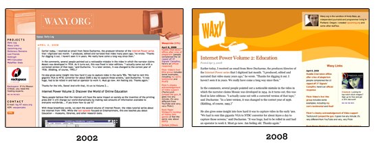
For the first time since I started blogging in 2002, I’ve redesigned Waxy.org. Over the last six years, I’ve grown pretty sick of the old design but never found the time to rework it. Mostly, the changes are cosmetic. Cleaner design, new logo, bigger type, headlines, better iPhone support, and more space devoted to Waxy Links.
I’ve also taken the opportunity to change my URL structure, removing some cruft and giving some additional length to the slugs. All old URLs should redirect, thanks to some mod_rewrite magic and a little PHP.
One change that might affect you is that you’ll now be seeing all of my longer articles in the Waxy Links feed, so you might want to unsubscribe from the main feed to avoid getting duplicates. Since I generally only post once a day, and I try to only write things I’d want to link to, this seems like a good alternative to linking to my own posts. If you really don’t like this change, please let me know privately and I’ll work something out.
What do you think? Nothing’s permanent, so I’m all ears.
Update: You’re probably seeing some weirdness in the RSS feed. Links appearing in the articles RSS feed, tons of old entries, and links pointing directly to Waxy.org instead of the sites I was linking to. All of these problems are fixed! But feedreaders take time to update, so it’ll be resolved as soon as your RSS reader of choice sees the updated feed. Sorry!
Looks great to me! Merging the feeds is a bit surprising, but fine. I have a big bolus of new entries in my feedreader for both feeds, so it must be working right, though I expect that I should drop one of them. 🙂
For your site in particular I like having two feeds. Also, I don’t mind when you self-link from the links feed to your own posts.
But I’m a longtime fan — I wonder how more casual readers and subscribers will react.
I originally considered only having a single feed, but realized that people who only wanted to read my low-frequency main site would be out of luck. So right now, the main feed will only show featured posts, and the links feed shows both links and featured posts.
It looks great! I like this design much better than your old one. Very clean and easy to read.
Yeah I have 96 unread posts suddenly showing in my RSS reader! No problemo I’ll subscribe to the links feed. Loving the new look though 🙂
I love it! I’ve only recently (in the last couple of months) become a big Waxy fan. The prehistoric design was what put me off whenever I followed a link here previously — judging a book by it’s cover and all that but that’s how it happened. I think the great new design more accurately reflects the great content.
look great. love the nice bright yellow. Your site no longer makes me think you are an old man.
Bit surprising to find like 500 new posts from you in Google reader. Who wants low frequency posts? Kottke merged the links in to the main feed awhile ago.
I mean it’s not like your adding your Twitter feed and del.icio.us favorites. I think it would be legitimate to just have one feed. But I’m on board either way.
I am in instant love. I’ve been secretly wanting the dingy salmon to be gone for a while.
Jim: Prehistoric is a great way to describe it. I think the design was dated when I launched it.
Everyone: Sorry about all the new RSS items, not much I can do about that. Mark them all read, and start fresh!
I love the redesign, but I have to say I preferred when the RSS feed took me directly to the linked page instead of to waxy.org/links with an anchor. (The anchors don’t seem to go anywhere, incidentally, but that might be a problem on my end — I can see the tags in your HTML.)
I like it, it seems much more organic and fluid. You might want to update your ‘favicon’ – it looks like the old site layout.
Ah, it’s very refreshing. I too was ready to see the salmon go. A few things:
– Is the favicon going to be updated? (Or maybe it is, and I’m just getting an old cached version.)
– The header is a bit massive, to me, with the larger vertical logo and more space, but I don’t really know a problem with just about everyone above 1024 these days. Mostly, as you can see in your side-by-side, the first line of content is about where your 8th line of content was in the old design. Maybe you’ll have new things to fill that to-the-right-of-the-logo space with, I suppose.
– I love the wider links section. I assume you felt like it was fine to lose all the left-bar stuff…seems good to me, I can’t remember clicking anything over there in quite some time (or, aside from contact info and a couple semi-abandoned projects, what was even over there).
Dan: Thanks for catching that. I fixed the Links RSS feed to go directly to the link, instead of my site.
Looks great! I’ve subscribed to your links feed for years and was pleasantly surprised to see your other posts mixed in yesterday.
I’ve been visiting and reading since 2002.
Feed is great – I like how I woke up this morning and saw links/blog-posts all bundled into one feed.
On the design end, it’s still simple with a nice visual gleam to the eye.
Cheers and keep those links-a-comin, I’ll be a-reading.
So THAT’S why Google Reader exploded with 100 posts from you today.
FAIL
(Kidding!) Nice job, Andy!
The font choices (Arial!) look a bit off to me, but that’s a matter of personal preference (and why we’ve got Stylish on Firefox, I guess).
Seconding Dan’s note regarding the RSS feed on “Links”: I think it makes more sense when a feed item’s title is a direct link, instead of a permalink to “Links”.
I would still vote for permalinks to remain though, somewhere in the template, in a not-as-prominent way. Sometimes, in a link’s description you may add more links that are related to the main links. As is the case now, I have to bookmark each link individually; whereas with the permalinks I can just bookmark the main link and add a note (in del.icio.us) like: “cf. http://waxy.org/links/permalink-to-item“. You may want to have a look at Daring Fireball’s Linked List.
Finally, will the “Links” page get this redesign (or rather, style) as well?
Again, good job!
I like the flat colour style, makes me think of the beach and sunburns for some reason. 😉
I think you’ve made all good choices here, it’s tons easier to read and easier to look at. The ~50px taller header is no big deal to me and I like that you did a combined feed. If someone is used to several items a day, adding one story every day or two is no big deal. Great redo on all fronts.
Love the new design.
I’m just happy to see the Vectrex made the cut. Maybe you could provide a theming engine that uses color transparent overlays for my monitor?
ooooooooo preeeeeeeetty
Like it. Glad you kept the vectrex.
My initial gut reaction is the header is too beefy, but even on my smaller screen it looks great. The new colors are cheerful.
The “Waxy Links” title in the sidebar could stand to be bigger perhaps.
Very nice but I would like to see some “page definition” along the side of the white area. Maybe a faux 3d shadow or something to make the main content/comment area pop. Start at the top right below where the yellow-orange meets the off-white background and go all the way down. I think this would also help to separate the right-column content from the main content.
Nice job, Andy. I like the new color scheme. Have you thought about adding an archive section for the main blog as well as a search form? Also, the Waxy Links section needs a refresh.
Hundreds of unread posts in Reader trumpeted the unveiling! 🙂
Surprisingly, I really enjoy how you’ve integrated the Deck ads. More-so, probably, than any other site who runs them.
Fresh.. love it!
I rather liked the old salmon page, myself, but the replacement is good too.
As for the feeds, it seems I’m the only one who prefers them separate. I’ve often considered getting a membership to Daring Fireball just to get the separate feeds for articles & links – I doubt I’ll ever follow through, as I don’t value it enough, but still. I like to read the articles properly, but I stick link-list feeds in a folder in NetNewsWire & skim the resulting combined list – it’s a lot faster than if I have to pick through to make sure I don’t miss the articles.
It doesn’t really matter, since you’ve still got the article-only feed, but it’s nice to miss out on the duplicates. Is there any chance you feel amenable to publishing three feeds (articles, links, combined)? *crosses fingers*
Whoo, looks nice! I really like it.
Thanks for merging the feeds, I always ended up marking on or the other as read (because I subscribed to both feeds). I’ve been behind for a long time, maybe I will just start fresh.
So, is this a good time to ask for things like OpenID in the commenting section? 🙂
Excellent work, Andy. So bright and… alive! Man, now I’m itching to get going on my own redesign.
If it were me, I’d make the “Waxy Links” title 18px, and left-aligned. But I’m a little crazy about minor stuff like that.
Looks good and the RSS options are a smart choice. Well done.
Looks great! But I agree with Mike about the lack of search/archives. There’s internet gold in them archives.
Great redesign! Congrats!
Looks great! I think yo’ve achieved your design goals. I like that you’ve kept the silhouette of the Vectrex (it was my favorite element of the original design).
-Another Andy
Stellar! Much easier on the eyes.
looks awesome! great redesign!
holy shit, andy, this is hot! good job!
The new design is much better. Maybe the way the content rectangle grows into the orange waves needs some fine-tuning. On a side note, the comments font looks a bit different than the main font, though it may just be size, and the Preview/ Submit buttons look a little unbutton-like.
Will you also redesign the links page (other than integrating it more strongly into the main page, which is a great move)?
Nice redesign Andy! Love the new apple-touch-icon.png too!
Just when I thought “there’s nothing new on the internets”, there you go making it new again : )
At last.
This final cut looks good, Andy! I am indeed pleased that some rights have been reserved.
Looks great! Huge improvement.
The header is way too deep though. A lot of wasted space there I think. Takes up nearly a third of my current browser size.
Brilliant, great work… and the combined feed is terrific too.
(and the header is _not_ too deep.. I’m not afraid of the scroll!)
This isn’t a big deal, but (for me at least) the page loads kind of slow.
Great work Andy,
at first I thought I had landed on the wrong page. It´s strange to get used to the new design after all these years, but it looks much cleaner and nicer now.
I hope it works for the next six or so years now. 🙂
I propose a short silence in memoriam of the salmon color. This looks better, sure, but it doesn’t make me nearly as hungry.
(It is a great look, really.)
I am digging the redesign. It gives the minimalist Waxy aesthetic I have come to expect, but it is now easier to read and has a modern feel.
By the way, not that the old site felt dated, but the presentation was not as crisp as the content provided…
Do a search for mdash on your home page dude, I think you been smokin’ your semicolons.
Loving the new design Andy 🙂
I like simple designs, good job!
Looking goooood. 😉
Camrias: Good catch, thanks. Funny that Firefox and Safari both display HTML entities properly without the semicolons.
SGML entities end before the first character which cannot be part of an SGML entity name, which is one of those fun facts that make you the center of attention at parties.
They do not, IE’s belief to the contrary, end with the first character which makes a recognized entity name, so “&mdash 1” is the mdash entity, and “&mdash1” is an unknown entity.
If it makes you feel any better about the default value of isPermaLink thing, at least you didn’t get called an “expert” who hasn’t ever read the spec over it.
Woot. Nice design.
The logo.png doesn’t display properly on IE6 — it’s in a gray box.
Otherwise: really really nice, very clean, and who cares if the top is tall because we as adults all know how to scroll.
Very readable.
And anyway if YOU like it that’s all that counts — it’s nice to see some individualism 😉
Cheers!
Très cool, hip.
Before I loved the content, hated the design. Now I love both = happy. : )
Love it.
Very cool theme.
I’d like to second SirPavlova’s request for an additional links-only feed. One of the reasons I do maintain a Daring Fireball Membership is to have access to the separate feeds. I prefer to enjoy my chocolate and peanut butter separately 😉