After running XOXO for two years, and doing a bunch of talks myself at various conferences, I’ve seen my share of presentation slides from non-designers.
Way too often, they look something like this:
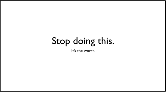
Inevitably, they use one of the two basic Keynote templates — black on white, or white on black.
I get it! You’re not a designer. You’re a writer, filmmaker, musician, whatever, and even learning how to make these slides was kind of a big deal for you. So you stick with the default templates.
The problem with any defaults is that they’re boring and overused, which distracts from your message. They suck any life out of your story, and fixing it is so easy.
So I made a little guide with six simple tips for XOXO speakers to improve their slides in a couple minutes. I thought you might find it useful.
1. Use the right resolution.
At XOXO, we project slides on a widescreen movie-like display (a 16:9 aspect ratio, if you want to get geeky about it). But many projectors only support the standard 4:3 ratio, the default for most presentation software like Keynote and Powerpoint and your old TV.
Ask your event organizer if slides will be projected in widescreen. If so, be sure to use the 1280×720 resolution when you start your presentation. Otherwise, you’ll end up with black bars on both sides of your slides.
If it’s not widescreen, stick with the default 1024×768 resolution.
2. Fill the screen.
One of the most agonizing, fixable things is seeing a photo that someone placed unresized in the middle of a slide, surrounded by a sea of whitespace. Take that photo and scale it to fill every edge of the slide, even if it cuts off the edges. It’ll look better, and easier to see from the back rows.

3. Move it up.
Don’t put anything important in the bottom third area of your slide. Depending on your venue, there’s a good chance the people in the back won’t be able to see it, blocked by the heads of everyone in front of them. But this shouldn’t be an issue, as long as you…
4. Make it big.
Never have more than four or five words on a single slide. Any more than that, and people will start reading them instead of listening to you. If it’s a longer passage or quote, you’re going to have to read it out loud anyway for the back rows, so you might as well leave it off the screen.
Oh, and make them huge. I don’t think I’ve used anything smaller than 96 point type in years. Best slides I’ve ever seen? Cabel Sasser’s at XOXO.
The full-bleed photos and big, bold centered type on colorful backgrounds frame him throughout the talk, and create a wash of color and imagery for him to talk over that you can see from the back of the room. And it photographs beautifully. Follow his lead.

Photo by Ian Linkletter
5. Add some color.
The Keynote default is white text on black, or black text on white. As a deliberate design choice, this can sometimes work. But most of the time, it’s pretty generic.
Consider using a wash of color behind your giant type. Not sure where to start? Go to Colourlovers and pick out a scheme you like, and stick to it.
Or put the type over a relevant, full-screen photo, as long as it’s not distracting from readability. Even subtle full-screen video can work, if done well. All you’re trying to do is provide some texture to your talk. The focus should be on you.
6. Change the type.
Gill Sans is a great typeface, but because it’s the Keynote default, it shows up everywhere and feels deadly boring. Avenir, Seravek, and Helvetica Neue Condensed Bold are safe bets and ship with current versions of OS X. If you know what you’re doing, drop some money on a good commercial typeface.
If you’re on Windows, there are free alternatives that work well. You could certainly do worse than Open Sans, Bebas Neue, Chunkfive, and so on.
Hope that helps!
Hurray! Agree on every point.
My secret weapon is practicing. People say they don’t want to sound stiff by over-practicing, but actors, stand-up comedians, and good presenters don’t look stiff to me. Whereas people winging it tend to be hard to follow and boring. Practice!
10 years ago this week: http://sethgodin.typepad.com/seths_blog/2007/01/really_bad_powe.html
As Guy Kawaski says “real CEOs demo.” Regardless of your title, if you need to make it snap, make it resonate, and inspire a crowd, you *must* refine your presentation craft.
Well done, as always, Andy. I agree with all the points. For those wanting to push into more advanced techniques, Nancy Duarte’s Slideology lays out the finer points of communicating with a group of humans in person.
Feeling like using something better as visualization of partnerships than the handshake icon? There’s a list of 100 better suggestions like peanut butter and jelly, salt and pepper, etc that make you rap your own knuckles for all the visual cliches you’re ever perpetrated.
Perhaps you should inform guests prior to the conference that you have some guidelines for their slides to make them “snap”.
It would terribly suck to get a chance to do a presentation at your conference, while feeling good about what I was promoting, only to have the conference organizer shit all over your efforts, in his blog, because they didn’t meet the anal retentive guidelines for a slide presentation.
Just relax. It’s only a slide show.
This is why books like Presentation Zen and Slideology are so beneficial. We have a lot of advice for speaking at conferences in speakercampbook.com, and a good story teller can make boring slides pretty easy to forget–slides can really be a crutch for people (myself included).
@Bart: Isn’t that exactly what this is? It’s the guide Andy sent to XOXO speakers. Obviously slightly tweaked post-event but I think you’re misinterpreting.
Bart: Rob’s right. That’s exactly what this is, and I said so in the post. It’s a guide I wrote for future XOXO speakers.
I have no idea where you got the impression I was “shitting all over their efforts”, but all of our speakers did a ridiculously amazing job. See my last post where I gush for paragraphs about them.
This is just a list of tips I thought might help other non-designers.
“Take that photo and scale it to fill every edge of the slide, even if it cuts off the edges. It’ll look better, and easier to see from the back rows.”
But only if the photo is of sufficient size to be so enlarged. A 300×200 image stretched to fill the whole screen looks awful. If your image is too small to fill the screen without pixellation, you’re probably better using a different image.
If it’s crucial you use that photo, framing it can sometimes be helpful. I’ve written up an example here:
http://whyareyoudoingthis.com/tips/use-large-high-quality-photos
See Jesse Schell’s captivating presentation for presentation inspiration
http://fora.tv/2010/07/27/Jesse_Schell_Visions_of_the_Gamepocalypse/10_Points_for_Eating_Cereal_Schell_on_the_Gamepocalypse
It’s difficult to acquire exceptional producing like the one you have currently.