In June, data journalist David Yanofsky wrote a Quartz article about chart design, “It’s OK not to start your y-axis at zero.”
Last month, Vox followed with a more spirited defense of the practice, “Shut up about the y-axis. It shouldn’t always start at zero.”
Both publications noticed a common trend: any time they published a chart that truncated the y-axis, they’d get a bunch of angry emails and tweets claiming it’s deceptive. But Vox and Quartz are absolutely right — context matters, and often, starting a chart at a zero axis can mislead too.
Vox’s article led to some angry responses, like this one from writer Ramez Naam:
Seldom have I seen @voxdotcom get something so wrong. https://t.co/ErktflVKKH Truncating the Y-axis really is dishonest in most cases.
— Ramez Naam (@ramez) November 19, 2015
Today, the National Review tweeted this (now-deleted) incredibly misleading chart about climate change, inadvertently proving Quartz and Vox right.
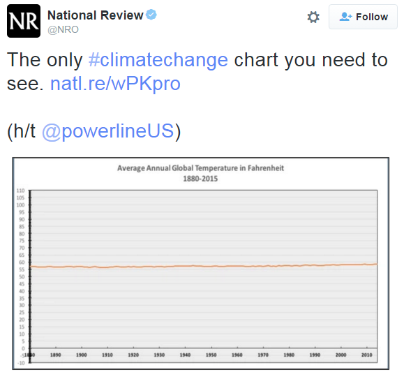
Twitter had a field day with it.
it’s crazy how my height has barely changed at all my whole life pic.twitter.com/pqUyzr20NQ
— Seth D. Michaels (@sethdmichaels) December 14, 2015
@NRO @powerlineUS Why, I’ve barely changed! pic.twitter.com/lFsze2v8ES
— Jim Pettit (@jim_pettit) December 14, 2015
.@NRO @powerlineUS WOW!!!!! this chart shows gun violence isnt a issue either pic.twitter.com/TLGEjoHNmQ
— jomny sun (@jonnysun) December 14, 2015
The only #undocumentedimmigration chart you need to see. @NRO @powerlineUS #FunWithYAxes pic.twitter.com/3WJR4Ggd94
— Jeff Yang (@originalspin) December 14, 2015
Snark aside, here’s one way to make the chart meaningful again.
.@NRO @powerlineUS @bradplumer I’m sure someone else has fixed this for you, but here you go. Great idea, thx — pic.twitter.com/VxgcGalcSa
— City Atlas (@cityatlas) December 14, 2015
Zero Kelvin, please.
Not to gainsay the message of the article, but the examples shown are missing the point, because they are messing with the scale of the Y-axis. @jim_pettit could have used a 0-50 Y-axis for a normal-looking chart.
Graphs that convey information using relative area need to start at 0. Though adding historical context is helpful, that is what’s wrong with the Fox graph shown in the Vox video. While this isn’t critical for timelines, there are easy to intuit guidelines for setting the bounds of the y-axis beyond “don’t lie.” For example, in a timeline of body temp, it’s fair to restrict values to those consistent with life.
See “The Elements of Graphing Data” (1994) by William Cleveland where he states, “There has been much polemical writing about including zero when graphs are used to communicate quantitative information to others. Too frequently zero has been endowed with an importance it does not have.” Pages 94-95 include an interesting example (CO2 data) and a note about a 1981 congressional hearing on global warming where “chartology” is mentioned by someone arguing for 0 on the y-axis (which would make a “preposterous graph” in Cleveland’s words). A great book and one that more people should study.