
Frotzophone, making music with interactive fiction
— the Z-Machine object tree as musical instrument; don’t miss the MP3 of him playing Zork via crummy.com #New York Magazine's long profile of FiveThirtyEight's Nate Silver
— if you haven’t, spend a little time reading about his methodology to understand how he’s totally changed the game #New York Times releases Campaign Finance API
— totals for each candidate by state or ZIP code and lookup by donor name, with JSON, XML, or serialized PHP output via Mike Migurski #New York and the Panic of 1873
— the NYT digs into their archives to find some striking parallels to today’s credit crisis #Splatter art exhibit depicts Looney Tunes character murder
— uncensored images from James Cauty’s show are now online and prints are for sale via blog.topherchris.com #Doodlebuzz, typographic news explorer
— draw a line to explore the news, branch lines to see related stories and excerpts via FlowingData #Jeremy Freese's Violet, entry for the IF Comp 2008
— best entry I’ve tried so far from the competition; hit enter a couple times to start playing #Colleen Venable's connect-the-dots giraffe tattoo
— culmination of three-year project trying to find a toy giraffe from her childhood #MoneyTalks, listen to stock prices rise and fall
— requires Flash 10 beta, or you can watch the sample videos instead #iminlikewithyou launches open API for multiplayer games
— the site’s changed radically in the last year, from casual flirting to almost pure gaming #Roundup of 84 knockoffs of Shepard Fairey's iconic Obama poster
— and I’m fairly sure that’s still a fraction of them via Laughing Squid #World of Goo is released to the public
— the best game I’ve played this year; coming to Steam and WiiWare later today #Simon Carless on Why LittleBigPlanet Is Web 2.0 For Games, Fulfilled
— it’s almost, almost worth buying a PS3 for #Academic paper studying knowledge sharing in Yahoo! Answers (PDF)
— the community’s split between answer people and discussion people, and the categories can be clustered accordingly #Ultima creator Richard Garriott launched into space
— Lord British spending 10 days on the International Space Station for a cool $30 million #Moral psychology testing on Amazon Mechanical Turk
— Brendan O’Connor’s blog is one of my new favorites; he works at Dolores Labs #Conplot, a commandline plotter with ASCII art
— for use with piping from sort|uniq -c and the like #Preview of Gomibako, like Tetris with garbage
— every object has physical properties, so trash can be crushed, burned, or toppled #
Gary Vaynerchuk on recession-proof marketing and dumb advertising
— don’t miss the part where he queries his UStream followers in real-time #Memeorandum Colors: Visualizing Political Bias with Greasemonkey
Like the rest of the world, I’ve been completely obsessed with the presidential election and nonstop news coverage. My drug of choice? Gabe Rivera’s Memeorandum, the political sister site of Techmeme, which constantly surfaces the most controversial stories being discussed by political bloggers.
While most political blogs are extremely partisan, their biases aren’t immediately obvious to outsiders like me. I wanted to see, at a glance, how conservative or liberal the blogs were without clicking through to every article.
With the help of del.icio.us founder Joshua Schachter, we used a recommendation algorithm to score every blog on Memeorandum based on their linking activity in the last three months. Then I wrote a Greasemonkey script to pull that information out of Google Spreadsheets, and colorize Memeorandum on-the-fly. Left-leaning blogs are blue and right-leaning blogs are red, with darker colors representing strong biases. Check out the screenshot below, and install the Greasemonkey script or standalone Firefox extension to try it yourself.
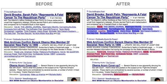
Note: The colors don’t necessarily represent each blogger’s personal views or biases. It’s a reflection of their linking activity. The algorithm looks at the stories that bloggers linked to before, relative to all other bloggers, and groups them accordingly. People that link to things that only conservatives find interesting will be classified as bright red, even if they are personally moderate or liberal, and vice-versa. The algorithm can’t read minds, so don’t be offended if you feel misrepresented. It’s only looking at the data.
For example, while Nate Silver of FiveThirtyEight may be a Democrat, he has a tendency to link to stories conservative bloggers are discussing slightly more often than liberal bloggers, so he’s shaded very slightly red. (Geeks can read on for more details about how this works.)