Today, Netflix posted some interesting research, tracking the performance of their streaming service on the top ISPs in the U.S.
Sadly, the charts were completely useless to me — a pile of mostly-indistinguishable lines. Along with one out of every 14 American males (about 7%), I’m red-green colorblind.
This is hard for non-colorblind people to understand, so I pulled together a couple examples. Here’s a split comparison of the original chart, showing what people with normal vision see compared to me and my crappy eyes.
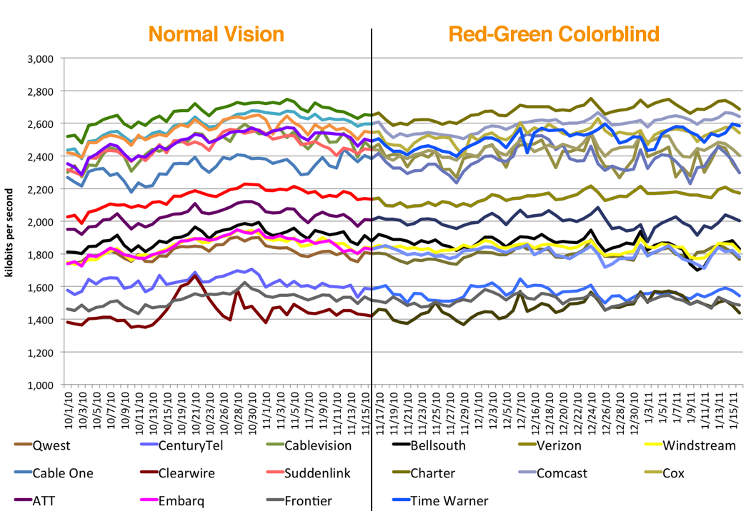
(Click to view large.)
Two simple solutions:
1. Label your lines. When you have more than three data points in a line chart, legends fall apart quickly whether you’re colorblind or not. A label next to each line makes any chart much more readable. Here’s a quick remake I whipped up. (Thanks to Greg for helping me get the colors right.)

(Click to view large.)
2. Pick colorblind-safe colors. If you have to use a legend, be kind and pick something people like us can see. Photoshop’s supported drop-dead simple colorblind simulation since CS4, or you can check your images or webpages for free using the Vischeck colorblind simulator.
When doing the right thing is this easy, it’s really disturbing when it’s dismissed as a waste of time.
A couple years ago, I contacted the husband-and-wife team behind Snopes, the essential resource on urban legends, to let them know about a similar issue. The red/green icons they use to indicate true/false urban legends looked absolutely identical to me. I let them know about the problem and prepared alternate GIFs for them, with a darker red and lighter green. (Incidentally, that’s why colorblind people don’t have trouble with stoplights.)
They not only refused the new images, but actually added a new entry to their FAQ, defending their position:
We chose our red-yellow-green coding system because its “traffic light” pattern can be understood by most of our readers with little or no explanation. While we understand that about 8% of our readership experiences some form of color blindness and therefore cannot distinguish the different colors of bullets, other alternatives we have tried have proved confusing to many of our non-color blind readers. Therefore, we have chosen to stick with a system that works very well for 92% of our readers.
Instead, they recommended hovering over every icon to see the tooltip text. I absolutely adore the work they do on Snopes, but that interaction’s left a sour taste in my mouth ever since. It just doesn’t seem defensible — is slightly darkening a shade of red and brightening a green too much to ask?
I wouldn’t expect anyone to be able to perfectly anticipate every person’s needs; accessibility is extremely hard to get right 100% of the time. But if your ultimate goal is conveying information, open ears and a little empathy can go a long way.
Update: Alex Bischoff took the three images I made for Snopes, and wrote a user script that replaces their images with mine. Install it here for your browser of choice.
Colour-blind or not, its still impossible to read.
Thanks! I had the same problem.
Just a minor correction. If color-blindness affects 1 in 14 males, but far fewer females, then we are not talking about 7% of audience, but more like 3.5%.
That said, the reaction at snopes was ludicrous. I once dealt with a similar attitude designing a system with a graphics designer. I suggested changing some stop light icons/gifs, changing them from circles to alternate shapes like circle/triangle/square for Red/Amber/Green (a la iChat). She refused.
Whenever doing graphs at work I always bear in mind that we only have B/W printers, so I add a pattern to the lines to help distinguish.
Whoops, I meant to write “male audience” in that paragraph. Thanks for the correction.
It’s interesting that they’re so committed to the “traffic light” analogy. These assessments are about unchanging conditions: true, false, plausible, etc.. Traffic lights by definition change frequently. Simply replacing the icon with a text label might not feel clever, but would be preferable. Just as you’ve done with the Netflix chart, direct labeling, whenever possible means less work for the reader.
I have to agree with JoolaPrime, I’m not colour-blind and the graph is still just about impossible to read.
Great post — and that response from the Snopes folks is nothing short of stunning.
There are other relatively simple-to-implement visual effects that can create “color neutral” user experiences for relative dense data sets such as these. One is to provide a legend that handles a click or mouseover to change the alpha of all data sets (increase alpha for selected, decrease others), or other techniques to provide an obvious visual emphasis.
The Snopes folks wouldn’t need to change color if they would consider varying shape as well as color for the truth values. A check for true and an X for false, in addition to the color variation, would suit everyone regardless of the level of color vision.
I’m not colorblind (not that I know of anyway) but still have a hard time distinguishing some of those colors… a third solution would probably be to use different stroke types, like dashed, dotted, dash-dotted, etc., to aid the accessibility.
[this is good]
I work for a business intelligence consulting firm and this is something we tell our clients to be mindful of.
In case anyone looks at that split display and thinks “bullshit”: I am red-green colourblind, and to me that looks like a chart with a black line down the middle. The left and right side colours look identical.
You are raising awareness, which is important, and I enjoyed your Snopes anecdote. I tried the colorblind simulator on my own web site which is mostly black and white, so no issues there.
That Snopes is too small-minded to work out a reasonable accommodation brings me to this: it is too bad the ADA doesn’t cover the web.
-danny
There seems to be a problem with your split comparison graph. The colors on both sides are the same.
Problem is you could pulling my leg and I’d never know.
I have to agree with JoolaPrime. My color vision works fine, and the graph is still unintelligible.
Unless they were trying to make a case for how the ISP throughput changes over time, the use of time-domain graphs is pretty pointless. Perhaps a nice table of average plus standard deviation would have worked better?
do you use tableau software? the UI looks familiar from our software. had you tried our colorblind palette? I’m just curious to know if it provides any benefit over the other color sets we offer.
Those who are looking for assistance in designing effective data visualizations may want to check out http://colorbrewer2.org. While it’s primarily been designed for use by the mapping/spatial analytics community, we use their color palettes all the time in designing executive dashboards, business intelligence systems, and other data visualizations. They have an option to choose palettes that are color-blind safe.
My father and my daughter are color blind. They are missing red color. My daughter colored a ray of colors for science class. She got low grade and her friend told the teacher “Come On she is color blind.” The teacher changed her grade to B. She showed me the color she drew. I couldn’t believe it. All she sees are black brown green blue yellow orange.
Seems like they are from genetics.
Is there an Excel plugin or option to default Excel charts and graphs to colorblind-friendly colors?
I wonder if it might help to humanize that 7% of males. Here’s an idea of a rewrite of their policy:
Thanks for this great example! My 2 cents: Having a simulator for colorblindness in Photoshop is nice, but choosing 16 different colors for thin lines that are maximally distinguishable on a white background is already challenging, even without trying to account for colorblind users. For users with normal sight, thin lines of different shades of blue are harder to distinguish, and thin yellow lines are hard to see on a white background. Having to then apply a colorblindness filter in Photoshop to simulate how this looks to someone else could lead to a lot of frustrating trial-and-error tweaking. I would love a list of pre-tested and recommended top-5, top-10, and top-20 most easily distinguishable colors for thin lines on white, black, and grey backgrounds, for normal and colorblind users. Or even an algorithm to generate the top-N most distinguishable colors. (Any color perception scientists out there?) Links to expert advice welcome!
Wow, I now have an image to demonstrate how I see – usually with “this is how the colorblind see” images I can clearly see the difference, but here both sides look the same.
Thanks, from one eye-cripple to the other.
That graph is hard to read not just for color-blind people, but for non-colorblind people as well.
I would add that for the blind and others with severe visual impairments, the charts you refer to are even more useless and the accompanying text posted by the “Director of Content Delivery at Netflix” does very little if nothing to solve the problem. It would have been useful to include explanations on the content of the charts, either on the page itself or through the longdesc attribute. At the very least, an alt attribute. As it is, it completely fails.
I agree. I’m not colorblind, and I still have hard time making any sense out of this chart. It’s pretty worthless.
Thank you for doing this. I always wondered which company was which on that graph. I support labeling of things in graphs as you proposed, because there is no other way for me to figure out which is which.
Of course, I am also color blind 🙁
The problem is that it’s not a very useful graph, regardless of what colors were used. I don’t know what type of story they’re trying to tell just by looking at the graph. Charter’s at the top, and Clearwire’s at the bottom, but wouldn’t a bar chart show this much more readily? There’s no need for making it a line graph if there isn’t any substantial change over the time period displayed.