Last year, I fell in love with Diana Smith’s stunning CSS paintings: Francine, Vignes, and Zigario. (I loved them so much, I asked her to speak at XOXO’s Art+Code event last year.)
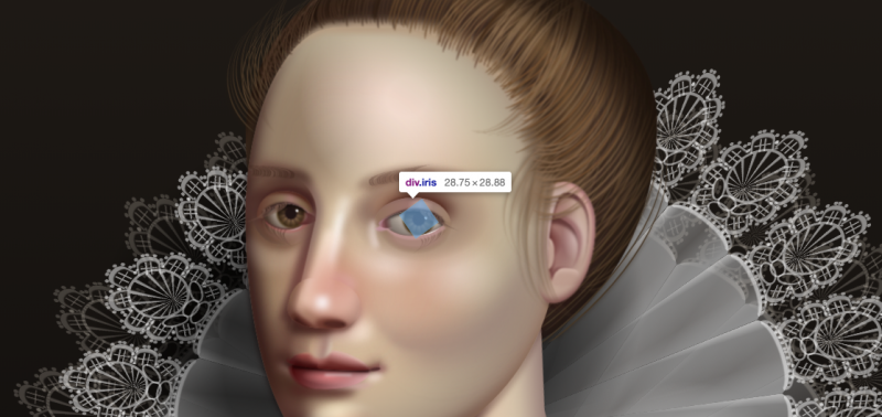
Incredibly, Diana types these out by hand, layering HTML elements and CSS properties with only a text editor and Chrome Developer Tools. In this post, she talks about the CSS properties she relies on most, with links to what her work would look like without each.
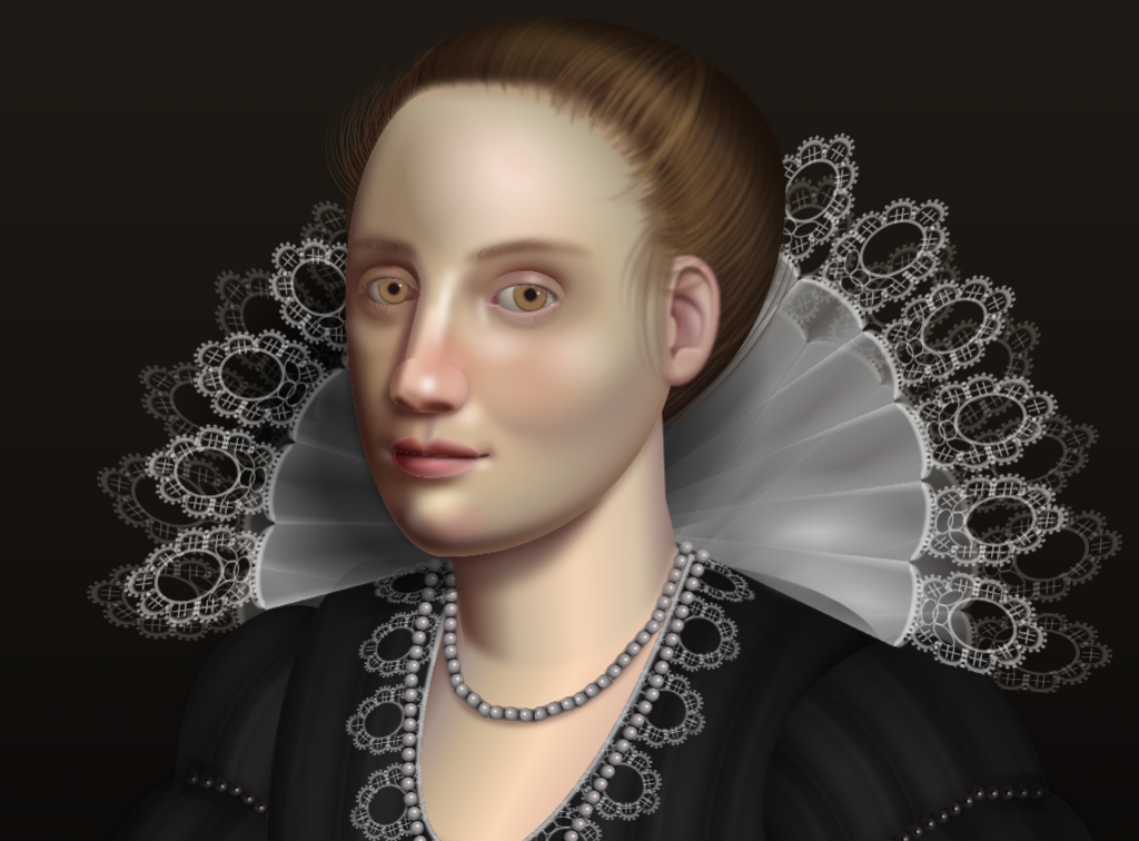
She just released her latest illustration, Lace, inspired by Flemish/baroque art and coded in two weekends, and it’s my favorite so far.
Her illustrations are designed for Chrome, but don’t let that stop you from viewing them in other browsers, especially older ones. Each collapses and distorts in unexpected ways, revealing the subtle differences between browsers as they evolved over time.
It’s only designed for Chrome, but don’t let that stop you from trying it in other browsers: the older, the better! Here it is in Chrome 17, Firefox 3.6, Chrome 9, and (my favorite) Internet Explorer 5.1.7 for Mac. pic.twitter.com/dFNYKi8Myf
— Andy Baio (@waxpancake) May 1, 2018
Here’s what “Lace” looks like in some other browsers I tried.
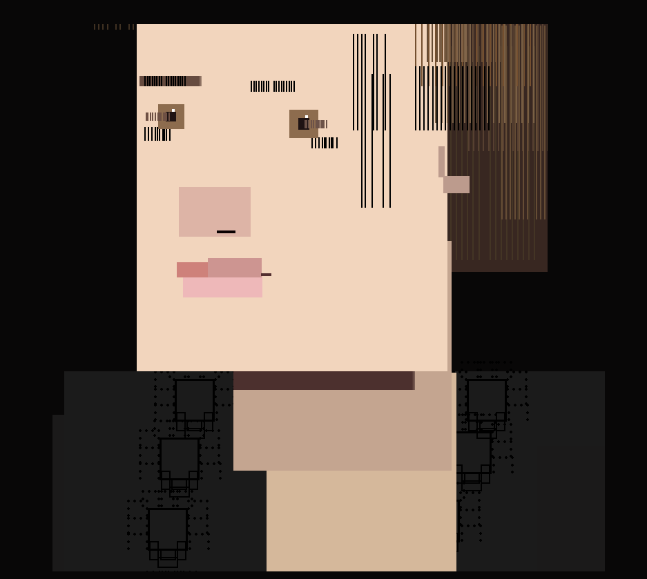
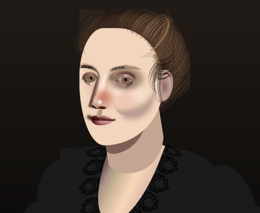
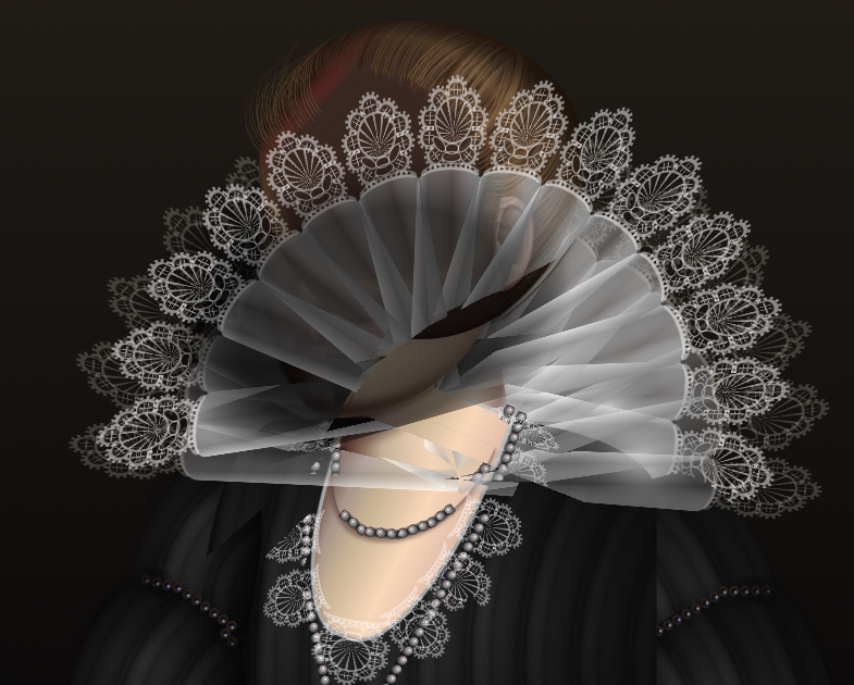
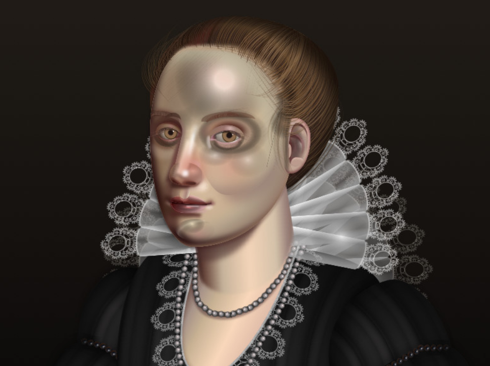

My theory is that Safari 10.01 tripped down some stairs, and two versions later, Safari 13 is feeling embarrassed about it.
Accidental ACID Test