Like the rest of the world, I’ve been completely obsessed with the presidential election and nonstop news coverage. My drug of choice? Gabe Rivera’s Memeorandum, the political sister site of Techmeme, which constantly surfaces the most controversial stories being discussed by political bloggers.
While most political blogs are extremely partisan, their biases aren’t immediately obvious to outsiders like me. I wanted to see, at a glance, how conservative or liberal the blogs were without clicking through to every article.
With the help of del.icio.us founder Joshua Schachter, we used a recommendation algorithm to score every blog on Memeorandum based on their linking activity in the last three months. Then I wrote a Greasemonkey script to pull that information out of Google Spreadsheets, and colorize Memeorandum on-the-fly. Left-leaning blogs are blue and right-leaning blogs are red, with darker colors representing strong biases. Check out the screenshot below, and install the Greasemonkey script or standalone Firefox extension to try it yourself.
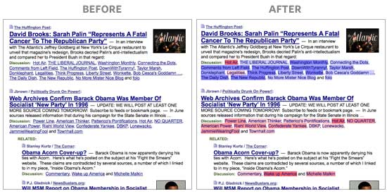
Note: The colors don’t necessarily represent each blogger’s personal views or biases. It’s a reflection of their linking activity. The algorithm looks at the stories that bloggers linked to before, relative to all other bloggers, and groups them accordingly. People that link to things that only conservatives find interesting will be classified as bright red, even if they are personally moderate or liberal, and vice-versa. The algorithm can’t read minds, so don’t be offended if you feel misrepresented. It’s only looking at the data.
For example, while Nate Silver of FiveThirtyEight may be a Democrat, he has a tendency to link to stories conservative bloggers are discussing slightly more often than liberal bloggers, so he’s shaded very slightly red. (Geeks can read on for more details about how this works.)