Spotify vs. Rdio: Who Has the Exclusives?

The new generation of streaming music services like Spotify, Rdio, and MOG have more music than you could consume in a lifetime. But how much of it would you really want to listen to?

There’s no shortage of great roundups and reviews showing the pros and cons of each service, but they rarely talk specifically about the different music you can find on each. They’ve all built impressive catalogs, but it’s nearly impossible to tell from casual browsing which artists and albums are exclusives for each.

Fortunately, both Rdio and Spotify offer powerful developer APIs, making it simple to compare the two. (Sadly, MOG doesn’t offer an API, so isn’t included.)

For this test, I needed a large set of popular, well-loved albums to test. I used the top 5,000 albums from Rate Your Music, the quirky 11-year-old online community dedicated to rating and reviewing music. These albums span all genres, from klezmer to chiptune, with a total of 2,282 different artists across 70 years of recorded music.

I used the Spotify and Rdio search APIs to look up each album, and checked their streaming availability in the United States. (Rdio uses the IP address to determine country of origin, making it impossible to query other countries. Spotify, on the other hand, returns a list of every region the album’s available.)

Note: The results aren’t perfect. Spotify and Rdio often have slight differences between artist and album names, which can deliver false positives. Let me know if you spot anything amiss and I’ll correct it.

Results

Of the top 5,000, about 44% were available on both Spotify and Rdio. 4.8% of the albums were only available on Spotify, while a further 6.8% were only available on Rdio. Overall, 56% of the albums were streamable on at least one of the services.

Labels are still withholding most or all of the albums from many popular artists. The Beatles, King Crimson, AC/DC, The Eagles, Tool, De La Soul, Peter Gabriel, Led Zeppelin, and Metallica are nowhere to be found, as well as most of the best albums by The Kinks. Music geeks will be sad to discover that Frank Zappa, Coil, Spacemen 3, and Joanna Newsom are all missing, as well. This landscape will constantly shift as labels change their minds; Arcade Fire was added to Spotify yesterday, and more than 200 indie labels left the streaming services last month.

But what about albums that are exclusive only to one service? The results surprised me. Spotify has a reputation for having a deeper catalog, but at least for historic critically-regarded albums, Rdio has a better selection of both popular and obscure artists. More albums in the top 5,000 were available on Rdio, and they offer exclusive access in the U.S. to huge acts like Bob Dylan, Pink Floyd, the White Stripes, and Queen.

Top Exclusive Artists

Here’s a list of the top 20 artists exclusive to each service, with the number of exclusive albums in parentheses.

Only on RdioOnly on Spotify
Bob Dylan (12)
Pink Floyd (8)
Bruce Springsteen (7)
Miles Davis (6)
The Gathering (5)
Blind Guardian (4)
Can (4)
William Basinski (4)
Iced Earth (4)
Stars of the Lid (3)
The White Stripes (3)
John Williams (3)
Queen (3)
Nevermore (3)
Thelonious Monk (3)
Charles Mingus (3)
Bill Hicks (3)
John Coltrane (2)
Camel (2)
Keith Jarrett (2)
My Dying Bride (4)
Miles Davis (4)
Candlemass (3)
Funkadelic (3)
The Pretty Things (3)
Current 93 (3)
Darkthrone (3)
Underworld (3)
Katatonia (3)
CunninLynguists (3)
Charles Mingus (2)
Mahavishnu Orchestra (2)
The Jesus Lizard (2)
The Misfits (2)
Klaus Schulze (2)
John Coltrane (2)
Galaxie 500 (2)
Silvio Rodríguez (2)
Secos & Molhados (2)
maudlin of the Well (2)

Note that artists like Miles Davis and John Coltrane appear on both lists because of how prolific they were. Both are well-represented in Spotify and Rdio, but some critically-adored out-of-print albums are unavailable on both.

Top Exclusive Albums

Digging into the albums, Rdio wins again. Nine of the top 100 albums are only found on Rdio, while only one is exclusive to Spotify. In fact, there are only 32 albums in the top 1,000 available on Spotify alone. Below is the top 30 for each service, along with their Rate Your Music ranking.

Only on RdioOnly on Spotify
Pink Floyd – The Dark Side of the Moon
Pink Floyd – Wish You Were Here
Bob Dylan – Highway 61 Revisited
Bob Dylan – Blonde on Blonde
The Clash – London Calling
Bob Dylan – Bringing It All Back Home
Bob Dylan – Blood on the Tracks
Pink Floyd – Animals
Bob Dylan – The Freewheelin’ Bob Dylan
Bob Dylan – Another Side of Bob Dylan
Bob Dylan – The Times They Are A-Changin’
Dr. Dre – The Chronic
Stars of the Lid – The Tired Sounds Of
Camel – Moonmadness
The White Stripes – Elephant
Bon Iver – For Emma, Forever Ago
John Williams – Raiders of the Lost Ark
Popol Vuh – Hosianna Mantra
Jethro Tull – Nothing Is Easy: Live at the Is…
Albert King – Born Under a Bad Sign
Keith Jarrett – Vienna Concert
Dead Kennedys – Plastic Surgery Disasters
Thin Lizzy – Black Rose: A Rock Legend
Magic Sam – West Side Soul
Bob Dylan & The Band – The Basement Tapes
Eric Dolphy – Out There
Blind Guardian – Live
Devin Townsend – Terria
Strapping Young Lad – City
Pretenders – Pretenders
The Zombies – Odessey and Oracle
Candlemass – Nightfall
Funkadelic – Standing on the Verge of Getting…
The Jesus Lizard – Goat
The Pretty Things – Parachute
The Jazz Composer’s Orchestra – The Jazz Comp…
Klaus Schulze – X
Sodom – Agent Orange
Danny Elfman – Edward Scissorhands
Galaxie 500 – Today
Current 93 – All the Pretty Little Horses
Secos & Molhados – Secos & Molhados
maudlin of the Well – Bath
Sun Kil Moon – Ghosts of the Great Highway
Anathema – Alternative 4
Darkthrone – A Blaze in the Northern Sky
The Byrds – Fifth DimensionMost Popular
The Gun Club – Miami
Autopsy – Severed Survival
My Dying Bride – Turn Loose the Swans
The Jesus Lizard – Liar
Vektor – Black Future
maudlin of the Well – Leaving Your Body Map
Jean Michel Jarre – Oxygene
16 Horsepower – Secret South
Riverside – Out of Myself
Darkthrone – Transilvanian Hunger
Nino Rota – Amarcord
Suede – Suede
Darkthrone – Under a Funeral Moon

Unless you’re a huge fan of Norwegian death metal, it’s hard to see this as anything but a win for Rdio. The fact is that both services have done a tremendous job of building the celestial jukebox — with a couple of high-profile exceptions, nearly everything you’d ever want to listen to is available at your fingertips.

Now, one huge drawback of using the Rate Your Music list is that it skews towards older album-oriented music geeks. That’s great if you like Ornette Coleman and Galaxie 500, but not so great if you like Drake and Katy Perry.

Next week, we’ll set the controls for the heart of mainstream music: the Billboard charts, analyzing every charted single in the top 100 from 1955 to the present. This will give us a completely different view of their catalogs, focused on pop singles, past and present, instead of classic albums.

Want more? Ed Summers did his own fascinating deep-dive into Spotify and Rdio uses top album lists from Alf Eaton’s Album of the Year list collection, and published the results on Google Fusion Tables. Also, try Matt Montag’s Music Smasher, a tool that searches Rdio, Spotify, and Grooveshark.

(Note: This was originally published for my Wired column.)

Leave a comment

No Copyright Intended

On October 26, a YouTube user named crimewriter95 posted a full-length version of Pulp Fiction, rearranged in chronological order.

A couple things struck me about this video.

First, I’m surprised that a full-length, 2.5-hour very slight remix of a popular film can survive on YouTube for over six weeks without getting removed. Now that it’s on Kottke and Buzzfeed, I’m guessing it won’t be around for much longer.

But I was just as amused by the video description:

“The legendary movie itself placed into chronological order. If you’d like me to put the full movie itself up, let me know and I’ll be glad to oblige. Please no copyright infringement. I only put this up as a project.”

These “no copyright infringement intended” messages are everywhere on YouTube, and about as effective as a drug dealer asking if you’re a cop. It’s like a little voodoo charm that people post on their videos to ward off evil spirits.

How pervasive is it? There are about 489,000 YouTube videos that say “no copyright intended” or some variation, and about 664,000 videos have a “copyright disclaimer” citing the fair use provision in Section 107 of the Copyright Act.

Judging by his username, I’m guessing crimewriter95 is 16 years old. I wouldn’t be surprised if most of those million videos were uploaded by people under 21.

He’s hardly alone. On YouTube’s support forums, there’s rampant confusion over what copyright is. People genuinely confused that their videos were blocked even with a disclosure, confused that audio was removed even though there was no “intentional copyright infringement.” Some ask for the best wording of a disclaimer, not knowing that virtually all video is blocked without human intervention using ContentID.

YouTube’s tried to combat these misconceptions with its Copyright School, but it seems futile. For most people, sharing and remixing with attribution and no commercial intent is instinctually a-okay.

Under current copyright law, nearly every cover song on YouTube is technically illegal. Every fan-made music video, every mashup album, every supercut, every fanfic story? Quite probably illegal, though largely untested in court.

No amount of lawsuits or legal threats will change the fact that this behavior is considered normal — I’d wager the vast majority of people under 25 see nothing wrong with non-commercial sharing and remixing, or think it’s legal already.

Here’s a thought experiment: Everyone over age 12 when YouTube launched in 2005 is now able to vote.

What happens when — and this is inevitable — a generation completely comfortable with remix culture becomes a majority of the electorate, instead of the fringe youth? What happens when they start getting elected to office? (Maybe “I downloaded but didn’t share” will be the new “I smoked, but didn’t inhale.”)

Remix culture is the new Prohibition, with massive media companies as the lone voices calling for temperance. You can criminalize commonplace activities from law-abiding people, but eventually, something has to give.

Update, February 11: Everybody’s singing the YouTube Disclaimer Blues.

146 Comments

Tracking the U.S. Government’s Response to #Occupy on Twitter

It’s no exaggeration to say that Occupy Wall Street first started on Twitter. As the New York Times reported Monday, the #occupywallstreet hashtag was conceived in July, a full two months before the first tent was pitched at Zuccotti Park.

As it grew from a single camp into a movement, Twitter was essential for getting real-time updates out as events unfolded, for both supporters and local government.

Particularly in the last month, some city officials have used Twitter as a tool to keep people informed. Even as they were dismantling camps, the mayors of New York City and Portland, Oregon were posting real-time updates and responding to citizens directly.

While city officials have actively communicated their positions, the response from the federal government has been muted, at best. The Occupy movement’s concerns are much larger than city politics, with most proposed demands requiring cooperation from Washington.

So far, official statements are isolated and infrequent — an early endorsement from the president, a couple of statements from the White House press secretary, and a range of opinions from individual members of Congress.

But maybe the situation’s different online? Twitter is much more casual and conversational, and social media-savvy federal agencies often respond directly to queries and complaints from their followers. It’s possible that federal employees are addressing questions and concerns about Occupy on Twitter instead.

I decided to find out.

Data Wrangling

I originally gathered this data to build the Federal Social Media Index, a weekly report that compares federal agencies using Twitter, which I’m happy to release today as part of my work at Expert Labs.

Starting with an index of over 450 U.S. government departments and agencies, I asked the anonymous workforce at Amazon Mechanical Turk to find official Twitter accounts for each one.

Three workers researched each agency, and I approved the ones they agreed on and hand-checked the rest.

When I was done, I had a list of 126 official Twitter accounts representing a wide swath of U.S. government, from the Secret Service to the Postal Service. (Browse them all on the Federal Social Media Index or in the spreadsheet below.)

To collect all the tweets, I used ThinkUp, a free, open-source tool for archiving and analyzing social-media activity on Twitter, Facebook, and Google+ that I work on at Expert Labs.

With this dataset, I could easily tell which federal agency is the most popular (NASA), the most prolific (the NEA), and the most likely to reply to you personally (the US Census Bureau).

It also makes it very easy to see who’s talking about Occupy, and who isn’t.

Occupy Silence

Since the Occupy protests started in mid-September, nearly 15,000 messages were posted by the 126 federal Twitter accounts.

Of those accounts, only three have mentioned the Occupy protests in any way — Voice of America, the Smithsonian, and the White House.

For those unfamiliar with it, VOA is a radio and television news network broadcasting in 100 countries in 59 languages, but banned from airing in the United States because of propaganda laws. As part of their daily news coverage, they’ve tweeted about Occupy nine times since the protests began. (Here’s the most recent.)

Second, the Smithsonian responded to a tweet by Complex Magazine, refuting rumors of an OWS-themed museum exhibit.

The only other mention of the Occupy protests: one tweet from the White House nearly two months ago.

Opening Up

The obvious reason for the silence is that the federal government doesn’t yet have a position on Occupy. If they haven’t issued a formal statement, blog post, or press conference, then why Tweet?

For starters, it’s a humane and natural way to open a dialogue with a generally forgiving audience. Some of these agencies have tens or hundreds of thousands of people who care about what they have to say, or they wouldn’t be following them.

Proactively talking about potentially challenging issues like Occupy is an opportunity to bring some humanity to government, and maybe even help shape policy.

(Note: This was originally published in my column in WIRED.)

Leave a comment

Viewing the UC Davis Pepper Spraying from Multiple Angles

I was stunned and appalled by the UC Davis Police spraying protestors, but struck by how many brave, curious people recorded the events. I took the four clearest videos and synchronized them. Citizen journalism FTW. Sources below.

Best viewed in HD fullscreen.

Top

briocloud, http://www.youtube.com/watch?v=K8Uj1cV97XQ

jamiehall1615, http://www.youtube.com/watch?v=wuWEx6Cfn-I

Bottom

OperationLeakS, http://www.youtube.com/watch?v=BjnR7xET7Uo

asucd, http://www.youtube.com/watch?v=6AdDLhPwpp4

74 Comments

Google Analytics A Potential Threat to Anonymous Bloggers

Last month, an anonymous blogger popped up on WordPress and Twitter, aiming a giant flamethrower at Mac-friendly writers like John Gruber, Marco Arment and MG Siegler. As he unleashed wave after wave of spittle-flecked rage at “Apple puppets” and “Cupertino douchebags,” I was reminded again of John Gabriel’s theory about the effects of online anonymity.

Out of curiosity, I tried to see who the mystery blogger was.

He was using all the ordinary precautions for hiding his identity — hiding personal info in the domain record, using a different IP address from his other sites, and scrubbing any shared resources from his WordPress install.

Nonetheless, I found his other blog in under a minute — a thoughtful site about technology and local politics, detailing his full name, employer, photo, and family information. He worked for the local government, and if exposed, his anonymous blog could have cost him his job.

I didn’t identify him publicly, but let him quietly know that he wasn’t as anonymous as he thought he was. He stopped blogging that evening, and deleted the blog a week later.

So, how did I do it? The unlucky blogger slipped up and was ratted out by an unlikely source: Google Analytics.

Reverse Lookups

Typically, Google will only reveal a user’s identity with a federal court order, as they did with a Blogger user who harassed a Vogue model in 2009.

But anonymous bloggers are at serious risk of outing themselves, simply by sharing their Google’s Analytics ID across the sites they own.

If you’re watching your pageviews, odds are you’re using Google to do it. Launched in 2005, Analytics is the most popular web statistics service online, in use by half of Alexa’s top million domains.

For the last few years, online SEO tools have published Analytics and AdSense IDs for the domains they crawl publicly, typically for competitive intelligence, such as ferreting out your competitor’s other websites.

But in the last year, several free services such as eWhois and Statsie have started offering reverse lookup of Analytics IDs. (Most also allow searching on the Google AdSense ID, though I wasn’t able to find an anonymous blogger sharing an AdSense ID across two sites.)

Finding anonymous bloggers from Analytics is less likely than other methods. It’s still more likely that someone would slip up and leave their personal info in their domain or share a server IP than to share a Google Analytics account. But it’s also more accurate. Hundreds or thousands of people can share an IP address on a single server and domain information can be faked, but a shared Google Analytics is solid evidence that both sites are run by the same person.

And unlike any other method, it can unmask people using hosted blogging services. Tumblr, Typepad and Blogger all have built-in support for Google Analytics, though reverse lookup services haven’t comprehensively indexed them. (Note that WordPress.com doesn’t support Analytics or custom Javascript, so their users aren’t affected.)

Just to be clear, this technique isn’t new. The first Google Analytics reverse lookup services started in 2009, so the technique’s been possible for at least two years. My concern is that it isn’t nearly well-known enough. It’s not mentioned in any guide to anonymous blogging I could find and several established bloggers, engineers, and entrepreneurs I spoke to were unaware of it.

Unmasking an anti-Mac blogger may not be life-changing, but if you’re an anonymous blogger writing about Chinese censorship or Mexican drug cartels, the consequences could be dire.

I decided to see how pervasive this problem is. Using a sample of 50 anonymous blogs pulled from discussion forums and Google news, only 14 were using Google Analytics, much less than the average. Half of those, about 15% of the total, were sharing an analytics ID with one or more other domains.

In about 30 minutes of searching, using only Google and eWhois, I was able to discover the identities of seven of the anonymous or pseudonymous bloggers, and in two cases, their employers. One blog about Anonymous’ hacking operations could easily be tracked to the founder’s consulting firm, while another tracking Mexican cartels was tied to a second domain with the name and address of a San Diego man.

I’ve contacted each to let them know their potential exposure.

Protecting Yourself

Some of the most important and vital voices online are anonymous, and it’s important to understand how you’re exposed. Forgetting any of these can lead to lawsuits, firings, or even death.

If you’re aware of the problem, it’s very easy to avoid getting discovered this way. Here are my recommendations for making sure you stay anonymous.

  1. Don’t use Google Analytics or any other third-party embed system. If you have to, create a new account with an anonymous email. At the very least, create a separate Analytics account to track the new domain. (From the “My Analytics Accounts” dropdown, select “Create New Account.”)
  2. Turn on domain privacy with your registrar. Better, use a hosted service to avoid domain payments entirely.
  3. If you’re hosting your own blog, don’t share IP addresses with any of your existing websites. Ideally, use a completely different host; it’s easy to discover sites on neighboring IPs.
  4. Watch your history. Sites like Whois Source track your history of domain and nameserver changes permanently, and Archive.org may archive old versions of your site. Being the first person to follow your anonymous Twitter account or promote the link could also be a giveaway.
  5. Is your anonymity a life-or-death situation? Be aware that any service you use, including your own ISP, could be forced to reveal your IP address and account details under a court order. Use shared computers and an anonymous proxy or Tor when blogging to mask your IP address. Here’s a good guide.

Stay safe.

29 Comments

Arcade Improv: Humans Pretending to Be Videogames

At the PAX East conference last year, a young man approached the microphone during the Q&A with Mike Krahulik and Jerry Holkins, creators of the popular Penny Arcade webcomic.

Instead of asking a question, he bellowed, “Welcome to ACTION CASTLE! You are in a small cottage. There is a fishing pole here. Exits are out.”

An awkward pause, followed by some giggling from the audience. “Is it our turn to say something?” said Mike.

“I don’t understand ‘is it our turn to say something,'” said the young man.

Instantly, Mike and Jerry understood, along with everyone in the audience born before 1978.

“Go out!” said Jerry.

“You go out. You’re on the garden path. There is a rosebush here. There is a cottage here. Exits are north, south, and in.”

The game was afoot.

They were playing Action Castle, the first of a series of live-action games based on classic text adventures from the late ’70s and early ’80s. Game designer Jared Sorensen calls the series Parsely, named after the text parsers that convert player input into something a computer can understand.

In Parsely games, the computer is replaced entirely by a human armed with a simple map and loose outline of the adventure. No hardware and no code; just people talking to people.

It’s a clever solution to complex problems that have plagued game designers for decades. How do we understand the player’s intent? Can we make AI characters act human, instead of like idiot robots? Is it possible to handle every edge case the player thinks of without working on this game for the next 10 years?

Making computers think and react like us is hard. So instead of making software more human, some game developers are trying to make humans more like software.

It’s a similar approach used by Amazon for Mechanical Turk — their motto is “artificial artificial intelligence.” By layering an API over an anonymous human workforce, developers can solve problems that are best tackled by humans, but without the messiness of actual human communication.

Projects like Soylent add another layer of abstraction, invisibly embedding Mechanical Turk in Microsoft Word to crowdsource tedious tasks like proofreading and summarizing paragraphs of text. The effect feels weirdly magical, like technology that beamed in from the future.

In the gaming world, this substitution usually feels less like magic and more like robotic performance art. These performers are software-inspired actors — people pretending they’re videogames.

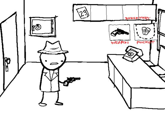
Nobody knows more about acting like a videogame than webcomic artist Andrew Hussie. Since 2006, he’s been running MS Paint Adventures, a series of increasingly insane reader-driven comics in the style of text-based graphical adventure games.

His first adventure, Jailbreak, started with a series of simple drawings posted on a discussion forum. With every new post, commenters would suggest new commands to further the gameplay, which he’d rapidly draw.

Hussie didn’t invent the genre — that honor likely goes to Ruby Quest and other denizens of 4chan’s gaming forums — but he certainly popularized it.

In the process, he became the world’s most prolific web cartoonist, sometimes updating up to 10 times a day.

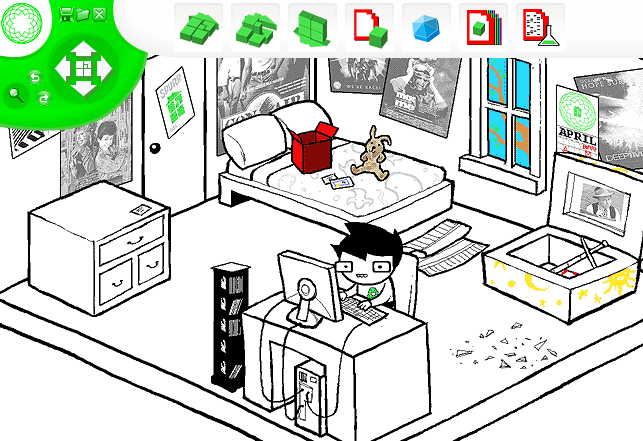
To get a sense of the scale, Problem Sleuth, his second adventure, spanned over 1,600 pages in one year. Homestuck, his latest adventure, contains a staggering 4,100 pages so far, making it the longest webcomic of all time in a mere 2.5 years. And he still has a ways to go, with act five (out of seven) wrapping up just last week. (By comparison, the Guinness Book of World Records cites Mr. Boffo creator Joe Martin as the world’s most prolific cartoonist, with a mere 1,300 comics yearly.)

Over time, Hussie’s experimented with the amount of reader input. With Jailbreak, he drew the first command posted after every image, but as the adventures grew in popularity — it currently averages 600,000 unique visitors daily — this grew wildly impractical.

“When a story begins to get thousands of suggestions, paradoxically, it becomes much harder to call it truly ‘reader-driven,'” wrote Hussie on his website. “This is simply because there is so much available, the author can cherry-pick from what’s there to suit whatever he might have in mind, whether he’s deliberately planning ahead or not.”

With his newest adventure, Hussie leans on reader input less frequently and less directly, but involves the community in other ways. (For example, they just published their eighth soundtrack album of songs entirely created by fans. Don’t get me started on the cosplay.)

MS Paint Adventures goes where no videogame can possibly go, with insane storylines, shifting rules, and a ridiculous number of objects to interact with.

In any game, every object or action added to the game multiplies the number of possible interactions. Add a gun, and the programmer needs to deal with players shooting every single other object in the game. Add a lighter, and you’d better prepare for players burning everything in sight. Math geeks call this combinatorial explosion.

Homestuck’s bizarre alchemy system supports 280 trillion combinations. But Hussie doesn’t need to draw them all, only the ones readers actually try.

Reader-driven games give the illusion of limitless options, at the cost of scale. Even at 1,600 pages per year, player demand far outstrips the efforts of a single cartoonist.

Frustrated with emotional expression in computer games, game design veteran Chris Crawford set out to build Storytron, a storytelling engine intended to model the drama and emotional complexity with computer-generated actors. Eighteen years later, Crawford is still working on it and emotional AI seems just as far out of reach.

Jason Rohrer, creator of the critically acclaimed art-game Passage, tackled the problem of emotional depth in a different way — he replaced the computer AI with a human.

Last year, he released Sleep Is Death, a quirky storytelling environment that connects a single player to a single “controller” over the network. The player has 30 seconds to make any move they can think of, and the controller scrambles to manipulate the scene to respond using a set of drawing tools.

The world is completely open-ended. The only limitation is the imagination of the player and controller.

As you’d expect, the results vary wildly, often depending on the relationship between the participants, but it’s always surprising in a way that many traditional videogames aren’t. Try browsing through SIDTube, the community-contributed gallery of Sleep Is Death playthroughs, and you’ll find everything from a child’s eye view of Hiroshima to meditations on growing old with friends.

Every playthrough is completely unique, a singular experience improvised by two people. Is that a game or performance art?

Earlier this year, a German theater group named Machina eX began staging live performances based on “point-and-click” adventure games like Secret of Monkey Island and Machinarium.

On the surface, Machina eX resembles other immersive performances like Tamara or Punchdrunk’s Sleep No More, with audience members following oblivious actors around elaborately-designed rooms.

In Machina eX’s performances, actors periodically get stuck in a loop, like a game paused. The audience must step in to solve the puzzle by manipulating objects in the room before the story can continue.

Each of these projects pull together elements of improvisational theater, performance art, and role-playing games.

But it’s the lens of videogames that separates them from Dungeons & Dragons, TheatreSports, and countless other collaborative games.

Each game borrows the conventions of a familiar game genre, preparing anyone who plays it with a set of expectations — the fundamental rules, terminology, constraints, and affordances are all well-known. Even better, storytellers can subvert any of those expectations at any time.

And unlike a game engine, human storytellers can go off-script. In the case of MS Paint Adventures, they can even switch game genres entirely, as Andrew Hussie’s done with Homestuck’s evolution from adventure game to Sims-style simulation to traditional RPG to whatever the hell this is.

Using live, real-time human ingenuity as the engine for videogames creates completely new, unexpected experiences unlike anything you can code.

In The Diamond Age, Neal Stephenson imagines a world where AI is extremely powerful, but still not convincing enough to convincingly simulate human behavior. Instead, AI characters are replaced by “ractors” — paid human actors who perform in virtual worlds for entertainment and education.

Even the all-powerful Wizard 0.2, the most powerful Turing machine in the land, is actually only used for data collection and processing — the real decisions are made by the man behind the curtain.

Chris Crawford and Peter Molyneux spent years trying to find Milo, but I think we’ll be waiting for a while yet.

In the meantime, I’m going to go pretend a game or two.

4 Comments

Supercut: Anatomy of a Meme

I spent last weekend revisiting the “supercut” meme, with a talk at WFMU’s Radiovision conference in New York and my new Wired column, which you can read below.

To cap it off, I spent a night revamping Supercut.org into a comprehensive, browsable database of supercut videos, with the help of Twitter’s Bootstrap CSS toolkit.

I’m very happy with how the site came out, so let me know if you have any suggestions and please submit any videos I missed. I also just added RSS and you can now follow @supercutorg for updates. Thanks!

For the last few years, I’ve tracked a particular flavor of remix culture that I called “supercuts” — fast-paced video montages that assemble dozens or hundreds of short clips on a common theme.

Many supercuts isolate a word or phrase from a film or TV series — think every “dude” in The Big Lebowski or every profanity from The Sopranos — while others point out tired cliches, like those ridiculous zoom-and-enhance scenes from crime shows.

Since 2008, I’ve added every supercut I could find to a sprawling blog post. With nearly 150 of these videos, and more being added weekly, it’s turned from a blog post into a minor obsession.

Earlier this year, I collaborated with NYC-based artist Michael Bell-Smith on Supercut.org, a 24-hour hack to make a supercut composed entirely out of other supercuts, along with a randomized supercut browser.

Today, I’m happy to announce that I’ve relaunched the site to let you browse the entire collection in different ways, subscribe to updates, or submit your own to the growing list. I’m also releasing the entire dataset publicly, which you can download at the end of this post.

To understand the rise of this new genre, let’s take a look back at how it began and how it’s evolved in the last three years.

The Proto-Cuts

While the web popularized the genre, the art world was experimenting with similar film cut-ups for years before YouTube was a gleam in Chad & Steve’s eyes.

Brooklyn-based critic Tom McCormack wrote the definitive history of the supercut, tracing its origins back to found-footage cinema, like Bruce Conner’s A MOVIE from 1958.

But it wasn’t until the 1990s that clear descendants of the genre emerged. Matthias Müller’s Home Stories (1990) reused scenes from 1950s- and 1960s-era Hollywood melodramas, filmed directly from the TV set, to show actresses in near-identical states of distress.

Christian Marclay’s Telephones (1995) showed famous actors answering ringing telephones in a string of surreal, disjointed conversations throughout Hollywood history. Edited together, the cadence and rhythm of nonstop clips feels very reminiscent of modern supercuts.

Apple tried to license Marclay’s film for the launch of the iPhone in 2007, but he refused. Instead, they made their own, borrowing the idea wholesale. (Marclay decided not to sue.)

As far as I can tell, the earliest supercut native to the web was Chuck Jones’ Buffies from 2002, which isolated every mention of “Buffy” from the first season of Buffy the Vampire Slayer.

While there were rare exceptions, supercuts really didn’t start proliferating online until around 2006. Why then? The likely cause: YouTube.

Before YouTube, it was incredibly difficult to both find and share video. After YouTube’s launch in 2005, searching through big chunks of film and TV’s recorded history became simple. Perhaps more importantly, sharing the video with others didn’t require server space, a huge amount of bandwidth, and a deep knowledge of video codecs. It just worked.

The result was that clips were easy to find and even easier to distribute. Combined with the rise of BitTorrent and the availability of affordable, easy-to-use video editing software like iMovie, it was the perfect environment for video remixing. The only missing ingredient is the time and passion to make it happen.

Supercut as Criticism

When I first started tracking the trend in 2008, almost every example was created by a superfan. Creating videos with hundreds of edits takes a staggering amount of time, and the only people willing to do it were those who were in love with the source material.

In the last three years, the form seems to have evolved from fan culture to criticism.

Rich Juzwiak may have started the trend by calling out reality TV contestants for their overused “I’m not here to make friends” trope. That directly led to supercuts criticizing lazy screenwriting, from “We’ve got company” to “It’s gonna blow!”

But recently, it’s being used for more serious criticism: calling out politicians and the news media. The Daily Show pioneered the reuse of archival news footage and quick edits to point out the absurdity of the news media and political figures, but online video remixers are taking it much further.

Video remixing group Wreck & Salvage took Sarah Palin’s speech about the Arizona shootings and removed everything but the sound of her breathing. The result, Sarah’s Breath, was a creepy example of supercut as political speech.

In March, artist Diran Lyons released one of the most epic supercuts ever — chronicling every time President Obama says “spending” in the complete video archive posted to the White House website. The result is six minutes long with over 600 edits.

The results are effective. Just as it was used to point out film cliches, a supercut sends a message about a public figure’s speech in a very short period of time. For that reason, I wouldn’t be surprised to see supercuts make their way into 2012 campaign ads.

Breaking It Down

I wanted to learn more about the structure of these videos, so I enlisted the help of the anonymous workforce at Amazon’s Mechanical Turk to analyze the videos for me.

Using the database of 146 videos, I asked them to count the number of clips in each video, along with some qualitative questions about their contents. Their results were interesting.

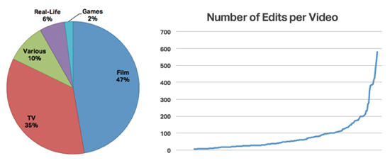
When looking at the source of the videos, nearly half come from film with a little over one-third sourced from TV shows. The rest are a mix of real-life events, videogames, or a combination of multiple types, as you can see below.

According to the turker estimates, the average supercut is composed of about 82 cuts, with more than 100 clips in about 25% of the videos. Some supercuts, about 5%, contain over 300 edits!

I asked the turkers whether each supercut was comprehensive, collecting every possible example, or if they were just a representative sample. For example, collecting every one of Kramer’s entrances from Seinfeld vs. a selection of explosions from action films. The results were split, with about 60% comprehensive. This could be attributed to film cliche supercuts, which don’t attempt to be thorough.

Finally, I was wondering whether each video’s creator was a fan or critic of the source material. The workers surveyed said that most supercuts were created by fans, about 73% of the time. This style of video remixing may be useful for criticism, but for now, it seems to mostly be a labor of love.

The Data Dump

Want to do your own analysis, or do some video remixing of your own?

You can view the full supercut database below or on Google Docs, or download the data as a comma-separated text file or Excel spreadsheet.

And, of course, let me know if you find any that I missed!

4 Comments

Google Kills Its Other Plus, and How to Bring It Back

News! This week, I started writing Codeword, a new weekly column for Wired.com. I’m covering a mix of data journalism, Internet culture, indie gaming, or whatever else I find interesting — the same kind of thing I’ve written here for almost a decade.

As part of the arrangement, I retain joint copyright and can republish my columns here after 24 hours, which I’m very happy about.

My first column went up on Wired yesterday, a thinly-disguised rant on Google’s removal of the + operator from search, which I noticed last Wednesday.

Obviously, this change isn’t the end of the world, but it got me thinking about how the importance of alpha users changes as services grow in popularity. I hope you enjoy it.

Google+ is the fastest-growing social network in history, with 40 million users since its June launch. To help them focus, Google’s quietly shuttered a number of products, removing iGoogle and Google Reader’s social features and closing Google Labs, Buzz, Jaiku and Code Search in the last two weeks alone.

But in doing so, they also killed off one of its oldest and most useful tools, from its most popular product.

On Wednesday, Google retired a longer-standing “plus”: the + operator, a standard bit of syntax used to force words and phrases to appear in search results. The operator was part of Google since its launch in 1997 and built into every search engine since.

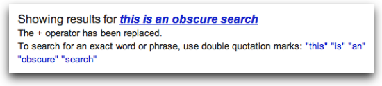
Unlike their other recent closures, the removal of + was made without any public announcement. It could only be found by doing a search, which advised the user to double-quote the string from now on, making “searches” look like “awkward” “Zagat” “reviews.”

Google wouldn’t disclose exactly why they phased it out, though it seems obvious that they’re paving the way for Google+ profile searches. When Google+ launched, instead of adopting Twitter’s @reply syntax, they coined their own format for mentioning people — adding a plus to the beginning of a name — triggering the future conflict with the + operator.

The fate of the “+” symbol was clear: protect a 12-year-old convention loved by power users, or bring Google+ profile searching to the mainstream? It was doomed from the start.

Geeks from Reddit and Hacker News were quick to condemn the move.

To understand why they’re upset about a single character, let’s step back to Google’s launch in 1997.

Why It Matters

For the first 12 years of its life, from its launch until early 2009, Google worked like this: every term you searched for appeared on every web page in its results. Nerds call this an “and” search — a search for “cherry pie” becomes “cherry AND pie.”

By comparison, the popular convention at the time was to return pages with any of the search terms present — an “or” search. The results were noisy and unhelpful.

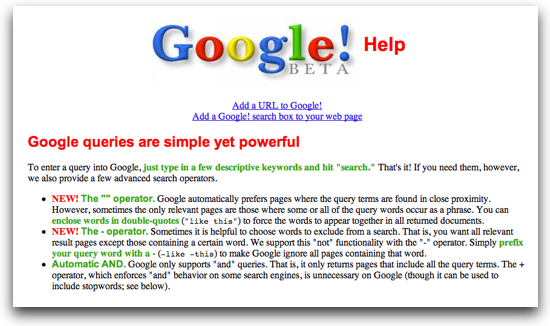
Google’s own help page, archived in February 1999, explained it:

Google only supports “and” queries. That is, it only returns pages that include all the query terms. The + operator, which enforces “and” behavior on some search engines, is unnecessary on Google.

At the time, this new feature was a godsend for savvy users. Because every term appeared in results, you could continue to refine your queries by simply adding new words to the search bar until you found what you were looking for.

As Google grew in popularity, this didn’t scale. Non-technical users don’t know what search terms to use or how to use search modifiers, and they shouldn’t have to.

Instead, Google needed to read minds to find what their mainstream audience was looking for, even if it meant ignoring what they actually wrote.

They started with the introduction of spelling suggestions, with “do you mean?” prompts introduced in 2003. By 2009, these were so successful that Google replaced the user’s search with the corrected words by default, though they always explicitly explained the change.

In January 2009, however, Google began experimenting with silently ignoring search terms completely.

For anyone deep-diving Google for the dark corners of the Internet, this change was hard to swallow. For the first time, searches were unreliable — an “or” search instead of an “and” search.

Journalists and software engineers, two classes of people who commonly search for obscure terms, objected to the change most.

“It’s incredibly annoying,” wrote Peter Rojas, gdgt founder and co-founder of Engadget and Gizmodo. “I hate how they don’t want you to do searches for exactly the words you’ve entered and nothing else.”

“I also use + constantly. It’s such a long-standing convention,” wrote Mat Honan, senior reporter for Gizmodo and former contributing editor to Wired.

Even Matt Cutts, head of webspam at Google, personally agreed. “My fingers are crossed for coming up with a better approach to this,” he said on Twitter. “As a power user, I want my escape hatch/safety valve for ‘Yup, I want exactly that weird word’ too.”

So, should we just “search” “like” “this” forever? Naturally, enterprising hackers are already routing around the perceived damage.

The Alternatives

As Google marginalizes its core base, it’s opened the door for smaller, more nimble startups, such as DuckDuckGo, a one-man project that’s quickly becoming the go-to search engine for discriminating nerds.

With a corpus of powerful search modifiers and a hard-line stance against tracking and personalization, it was created and maintained for the last four years by a single engineer, Gabriel Weinberg. This month, Weinberg announced DuckDuckGo accepted funding from Union Square Ventures and hired his first full-time employee.

For those unwilling to leave Google’s deep index, there are other solutions. One pseudonymous hacker made FindErr, a simple proxy that adds quotes to every search before shuttling the user off to Google.

My personal favorite is this simple userscript created by electrotype for Hacker News, which instantly adds quote marks to every submitted search. It works in Chrome natively and Firefox with the Greasemonkey plugin.

Too Hardcore

As a service grows in popularity, alpha users outlive their usefulness. The core users that helped build a service by word-of-mouth often find themselves dwarfed in numbers by people with very different needs.

Take the recently-announced changes to Google Reader, for instance. Reader is the most widely-used and deeply-loved feed reader ever made, steamrolling over several startups in the mid-2000s in the process. Any startup would be thrilled to have their devoted audience; within Google, Reader seems like a distraction.

Last week, the Reader team announced the removal of all of its social features, used by a relatively small but rabid fanbase.

Courtney Stanton, a Boston-based product manager, called Google Reader “the best social network created so far” in a passionate rant on her blog. “For me, this is the destruction of the only online space I truly give a shit about.”

There’s no easy solution. Should a company be expected to maintain features indefinitely because a tiny fraction of their base loves them? There are tangible costs to maintaining old code, and fringe features can clutter an interface, making user experience worse for those that don’t use them.

For those people, removing features is more than an inconvenience. It shatters an entire community. But, ultimately, their usage is a rounding error in the overall product activity.

With Google Search and the + operator, the consequences are far less dire. I asked Google what inspired the + removal, and how they balance the needs of power users with those of their mainstream base. “We’re sensitive to the needs of both newer users and ‘power users’ alike, and we’re always looking for ways to improve search for both groups,” a Google spokesperson said. “We make changes to search after rigorous testing shows that they improve the user experience.”

At Google’s scale, user testing can hide the behaviors and passions of entire subcommunities. The long-term implications of small changes like these are very hard to predict, especially with early adopters.

Who knows? If Google’s search engine dominance started with an “and,” it might just end with a “+”.

22 Comments

Apple's 1987 Knowledge Navigator, Only One Month Late

In 1987, Apple released this concept video for Knowledge Navigator, a voice-based assistant combined with a touchscreen tablet computer.

Based on the dates mentioned in the Knowledge Navigator video, it takes place on September 16, 2011. The date on the professor’s calendar is September 16, and he’s looking for a 2006 paper written “about five years ago,” setting the year as 2011.

And this morning, at the iPhone keynote, Apple announced Siri, a natural language-based voice assistant, would be built into iOS 5 and a core part of the new iPhone 4S.

So, 24 years ago, Apple predicted a complex natural-language voice assistant built into a touchscreen Apple device, and was less than a month off.

(Thanks to Hugh Dubberly for the video, who helped create it for ex-CEO John Sculley’s EDUCOM 1987 keynote in six weeks on a $60,000 budget.)

67 Comments

Geek's Guide to Portland

I have a bunch of friends coming into town for ROFLCon Summit on Saturday, and rather than email them my suggestions of stuff to do in Portland, I thought I’d make it public.

This is my guide to PDX for people like me: people who geek out about good food, beer, comics, and computers. It’s for people who want to experience the best of Portland in a short period of time, with a heavy focus on new stuff: many of the places listed here have opened in the last year.

One thing you’ll notice is that most of the best stuff isn’t in the downtown area. To really experience Portland, you’ll need to cross the bridge to the east side. But don’t worry, PDX is tiny and nothing will take you more than a few minutes by bus, bike, or taxi.

If you want any other suggestions, or have suggestions of your own, let me know!


View Waxy.org’s Essential Guide to Portland 2011 in a larger map

Restaurants

Tasty n Sons / Tasty n Alder (NE/SW)

If you have to choose one place to eat breakfast in Portland, go here. Imagine tapas-style small plates, but focused only on breakfast staples. A new downtown location brings a slightly different menu throughout the day and evening, both are great but get busy. Brunch daily from 9am.

Meat Cheese Bread and Bunk Sandwiches (SE/SW)

These two restaurants are focused on making the best sandwiches in Portland. If it’s late, try Bunk Bar in inner SE, which brings Bunk’s sandwiches to a bar-like setting.

Salt & Straw (NE/NW)

Tyler Malek’s creative flavors and farm-to-cone ingredients make this the best ice cream around. Try the pear w/blue cheese, honey-strawberry-balsamic with black pepper, or special flavors made with local microbrewed beers. Now with a second location on NW 23rd.

Pine State Biscuits (NE)

Heart-stopping, delicious biscuit sandwiches. I don’t think there’s a bad thing on the menu, but the Reggie and Moneyball are particularly great. If you skip breakfast, their Alberta location stays open until 1am on Fridays and Saturdays. (Their SE Belmont location closed in early 2013, soon to reopen on Division.)

Screen Door (SE)

Portland meets the South, with farm-to-table comfort food. Surprisingly great for vegans, with a menu of local organic sides and salads that changes weekly. Best fried chicken I’ve ever had. Get there before brunch (9am) or dinner (5:30pm), or be prepared to wait.

Apizza Scholls (SE)

Slice ranked it as one of the top five pizzerias in America, and the #2 pizza on the West coast in their March Madness bracket. Just get there when they open, or be ready to saddle up with a couple beers and wait.

Pok Pok (SE)

2011 James Beard-winning chef Andy Ricker kicked off a culinary renaissance in Portland with his frontyard grill-turned-restaurant empire. Inspired by Thai street food, you won’t find chicken panang anywhere near Pok Pok’s eclectic, face-melting menu. While you wait, grab a drink at the Pok Pok-owned Whiskey Soda Lounge across the street. And try a drinking vinegar, you won’t regret it.

Grüner (SW)

Delicious Alpine cuisine, my favorite new restaurant in the downtown area. They also just opened Kask, their newly-opened casual bar adjacent to the restaurant.

Boke Bowl (SE)

My favorite ramen in Portland. Not traditional, but excellent, Boke Bowl started as a series of pop-up ramen events around town before establishing their own location. I highly recommend the steamed buns and the pork ramen w/fried chicken. Vegan and gluten-free ramen options are available and delicious.

Tanuki (SE)

The motto of this quirky Japanese/Korean-influenced izakaya is “No kids, no sushi,” but I’d also add “no groups larger than three, no vegetarians, no picky eaters, no prudes, no prima donnas.” Just get the omakase for $20/person, order some drinks, play some pinball, and enjoy. My favorite restaurant in Portland, and some of the best meals I’ve ever had. Just be willing to go with the flow, or you’ll get your ass banned for life.

Food Carts and Late-Night Dining

The food cart scene in Portland is ridiculously amazing, a food culture revolution with over 670 carts in 25 “pods” (groups of carts), some spanning full city blocks. They can be a little hit-or-miss, but there are some amazing gems to be found. New this year: carts serving beer.

Note: Voodoo Doughnuts is for tourists. Like Le Bistro Montage, Whiffies Fried Pies and Potato Champion, these late-night staples became famous with locals by being open when bars let out. They should only be consumed drunk. (And even then, you can do better.) Any other time, they’re just mediocre. Want great donuts? Try the new Blue Star Donuts, a 10-minute walk from Voodoo.
Pyro Pizza, Whiffies fried pie, and Potato Champion poutine, photo by Stacy Clinton

Nong’s Khao Man Gai (SW)
Bangkok-born Nong Poonsukwattana offers only one item on her menu — khao man gai, a uniquely Thai street dish made from poached chicken and rice and sauce. Arguably the best cart in Portland, located at the sprawling SW 9th and Alder cart pod, the largest in town spanning two blocks. Closed Sundays. (Too busy? Try the to-go shop in SE.)

Cartopia (SE, weekends until 3am)

This collection of carts on SE Hawthorne at 12th is more known for its late-night hours and raucous vibe than the quality of its food. But if you’re hungry after a late night of drinking, it’s definitely worth trying Pyro Pizza’s wood-fired oven-in-a-cart and the crepes from Perierra Creperie.

Mississippi Marketplace (SE)

Since the closure of SE Division’s D Street Noshery, this is probably the best-curated cart pod in the city. Highlights include Minizo (ramen), Miss Kate’s Southern Kitchen, The Big Egg (breakfast until 2pm), Koi Fusion (Korean-Mexican fusion), and Prickly Ash (Chinese flatbread sandwiches). On a nice day, grab your food and sit on Prost’s deck with some oversized Belgian beers.

Drinking

Portland’s a big beer town, home to more microbreweries than any city in the world, though the distillery and cocktail scene’s grown in recent years. Here are my picks for the absolute best.

Hair of the Dog Brewing, Photo by throgers

Hair of the Dog (SE)

This microbrewery is beer geek heaven, capturing five out of RateBeer’s top six Oregon beers. A perfect place to try some of Portland’s best beer, though their tasting room has quirky hours, open only from 2-8pm, Wednesday through Sunday.

APEX (SE)

50 great beers on tap and a massive patio. Grab some excellent Portland-style banh mi from Double Dragon across the street, and settle in. Cash only, but if you use their ATM and show the receipt, they’ll give you $1 off.

Bye & Bye/Sweet Hereafter (NE/SE)

The Bye & Bye on NE Alberta and the Sweet Hereafter, its newly-opened sister on SE Belmont, are distinctly Portland institutions — vegan bars with food that’s shockingly tasty even for die-hard omnivores like me (try the chili pie!). Great beer list, delicious and strong cocktails served in Mason jars, comfortable vibe, and plenty of seating make this a great meeting place.

Bailey’s Taproom (SW)

There isn’t much atmosphere here, but Bailey’s makes up for it with the most interesting taplist in Portland — 20 beers rotating daily, selected by mega-beer geeks.

Green Dragon (SE)

With 50 beers on tap and huge indoor/outdoor spaces, this place is great for meeting large groups of people. The food menu and taplist can be hit-or-miss, but there’s always a handful of great beers in the mix. If you’re feeling experimental, try Cascade Brewing across the street, one of the few breweries in the U.S. focused on sour ales.

Distillery Row (SE)

If you’re here on a weekend, take an hour to sample Portland’s craft distillery movement on foot, doing tastings from House Spirits and Eastside Distilling to New Deal and Vinn. If you can only choose one, New Deal’s the best deal, with eight excellent liquors for $5.

Townshend’s Tea House (NE)

There’s no shortage of phenomenal coffee in Portland. (Coava is my personal pick.) But I’m not a big coffee drinker so I tend to head to Townshend’s, the best tea in Portland. Their bubble tea is best in town, with a wide range of flavors and your pick of tapioca, aloe or fruit jellies.

Attractions

Ground Kontrol at night, photo by Incredible Ape

Ground Kontrol (NW)

World-class ’80s video arcade and pinball gallery that turns into a 21+ bar after 5pm. Absolutely essential geek visit.

Powell’s Technical Books (NW)

Everyone knows about Powell’s Books, but geeks may be more interested in Powell’s Technical, an essential resource for modern and vintage books on science, math, computers, and engineering. It recently relocated directly across the street from the flagship store.

Floating World Comics (NW)

Portland has some great comic shops, but for art/indie/experimental comic lovers, Floating World can’t be missed.

Counter Media (SW)

On the other side of Burnside from Powell’s, Counter Media is a wonderful bookstore carrying a carefully-curated collection of indie comics and graphic novels, with crazy fetish stuff in the back.

Billy Galaxy (SW)

Though often wildly overpriced, this is nostalgia heaven. Go buy that Burgertime lunchbox you’ve always wanted.

Want more?

Looking for late-night options? I did a big roundup of the city’s best, as of May 2013.

The recommendations from Eater’s Top Restaurants and Heatmaps are consistently solid.

Have a great time!

19 Comments

Gamer Recreations of the World Trade Center

People deal with tragedy in different ways using the tools they have at their disposal. Painters paint, writers write, and gamers mod.

Lately, I’ve been interested in seeing how game modders and mappers have recreated the World Trade Center, the events of September 11, and the WTC Memorial in various game engines. Some of these are profane and offensive, quite likely made by teens that have no first-hand memory of the disaster, but most are intended as tributes. Here’s the best of what I was able to find.

Continue reading (250 words) ⇢ 4 Comments

Heello is Twitter for Pretending

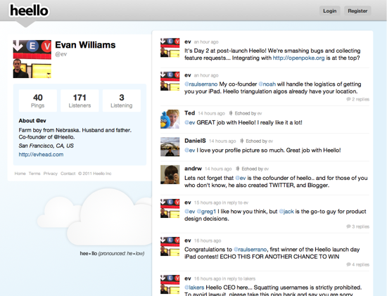
It’s easy to write off Heello as a Twitter clone. Created by the founder of Twitpic, the shameless knockoff looks and behaves like a stripped-down version of Twitter, down to the tweets pings, followers listeners, and retweets echos.

But it’s shaping up to be more than that. Creative fakesters are using the blank slate to turn Heello into the parallel-universe version of Twitter.

A world in which Heello was cofounded by Ev Williams (@ev), who acts as CEO and gives away free iPads to Heello users.

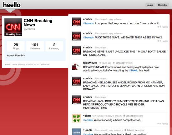
Where CNN Breaking News (@cnnbrk) reports all the news in ALL CAPS, including breaking news reports like “JUSTIN BIEBER” and “I JUST UNLOCKED THE ‘I’M ON A BOAT’ BADGE ON FOURSQUARE.”

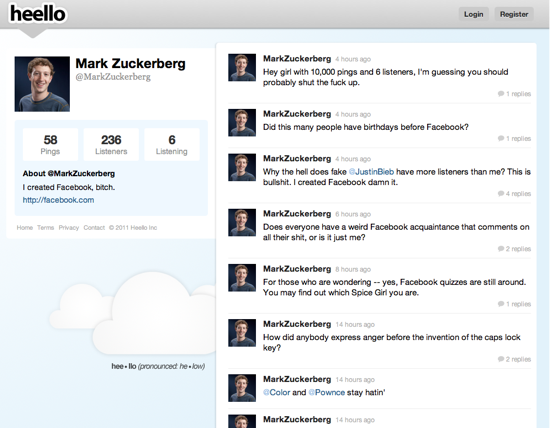
A world where Mark Zuckerberg (@MarkZuckerberg) is a profane, sexist womanizer.

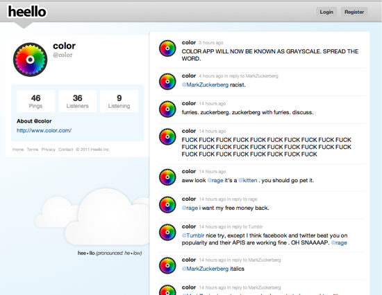
And where major web services (past and present) flirt and snark at each other, like @Tumblr, @Color, @4chan, and @Pownce.

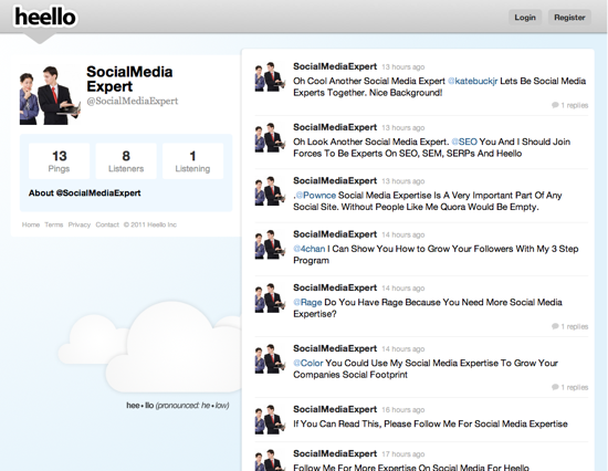
Of course, Heello wouldn’t be complete without its own Social Media Experts. “Please Check Out My Blogpost ‘How To Drive Qualified Traffic To Your Blog Via Heello.'”

Heello is like a blank-slate Twitter with no moderation or verification. I doubt the Heello team wanted or expected this behavior, but they inadvertently created a perfect playground for parody and meta-commentary, like Uncyclopedia or Encyclopedia Dramatica‘s parallel world versions of Wikipedia.

It should be fun to see how they respond.

Update: Marshall Kirkpatrick, lead writer of ReadWriteWeb, comments, “They told me they were going to remove any of these that weren’t clearly satires. That’s a real shame and shows a lack of sense of humor.” The first casualty was @ev, which was deleted shortly after this post was published.

16 Comments

There's No Wrong Way to Play Monopoly

Marco Arment just linked to this great article about how everyone plays Monopoly wrong. If you read the actual rules, it’s a completely different game than the one you likely grew up with — one that moves much, much quicker.

Five things I never knew about Monopoly’s official rules:

1. If a player decides not to buy a property, it immediately goes up for auction by the bank and is sold to the highest bidder. This blew my mind.

2. Houses must be built, and sold, evenly across a color-group. For example, you can’t build three houses on Park Place without having two houses on Boardwalk first.

3. It’s the property owner’s responsibility to ask for rent. If you forget to ask for rent before the end of the next player’s turn, you’re out of luck.

4. Rent is doubled on properties without houses in a monopoly.

5. Income tax is calculated from your total net worth, including all properties and buildings, not just your cash. And you have to decide whether to pay 10% or $200 before you add it up.

While these official rules gradually disappeared from common play, other unofficial “house rules” came to take their place. We always put funds collected from Chance/Community Chest cards into a “kitty” that was given to whoever landed on Free Parking. Many others gave $400 when landed on “Go,” or didn’t allow rent to be collected while in jail.

Many of us learned Monopoly like we learned the rules of dodgeball or rock-scissors-paper — spread by word-of-mouth from family and friends.

It’s interesting to see a commercial game see the same sort of cultural variation as other children’s folk games.

But maybe that’s appropriate for a game that was itself derived from another board game. Contrary to popular belief, Charles Darrow didn’t invent Monopoly in 1933 from scratch. It was heavily based on The Landlord’s Game, an innovative board game patented in 1904 by Lizzie Magie, to be a “practical demonstration of the present system of land-grabbing with all its usual outcomes and consequences.”

The Landlord’s Game and its variations like “Auction Monopoly” and “The Fascinating Game of Finance” spread by word of mouth throughout the early-20th century with evolving rules and hand-drawn boards, popular among the Quakers and used as a teaching aid for university students.

In 1933, Charles Darrow played a homemade version of The Landlord’s Game printed on oil cloth, saw the market potential, and tried to patent the new “Monopoly” as his own. After finding great success selling handmade versions, he sold the rights to Parker Brothers. Parker Brothers bought Magie’s patent for $500 to have an undisputed claim to the board game, but was threatened by other popular competitors and homemade variations. Through a process of litigation, acquisition, and quiet settlements during the late-1930s, Parker Brothers wiped all the other derivative versions of The Landlord’s Game off the map.

By the 1970s, Parker Brothers’ revisionist history was canon — the official Monopoly rules and a 1974 book on the history of the game stated that the game was created solely by Charles Darrow.

So, when someone says you’re playing Monopoly wrong, tell them you’re playing your own version… just like Darrow did.

Because everything is a remix.

24 Comments

Sweet Tea

I’m a regular at Meat Cheese Bread, my favorite sandwich shop in Portland. Even though I’m sick and feel like hell, I ventured out to pick up a to-go order today, because their egg salad sandwich makes everything better. John, the owner, was working the counter.

Me: Can I make a suggestion?

John: Sure.

Me: You guys should make a sweet tea.

John (emphatically): No.

Me: Why?

John: Because it’s disgusting. I make all the iced tea myself. Simple syrup’s over there. If you want to ruin it, go ahead.

Some people would get turned off by this, others would be downright pissed. But this is exactly what I like in a business, and it’s why I eat there at least once a week.

John’s singular, uncompromising vision is why the food is so damned great. He’s not trying to make a restaurant that makes everyone happy; he built a place that he’d want to eat at, and if you don’t like it, piss off.

Meat Cheese Bread. Photo by Tim Roth on Flickr.

The same goes for the web. I’d rather use a service that has a strong, single-minded vision, even if some of the decisions aren’t exactly how I’d want them, than a washed-out, milquetoast service created by committee, designed to meet market demand, that tries to make everybody happy.

Another way to put it: if someone out there doesn’t hate your product, it’s probably not worth using.

12 Comments

Lessons Learned from the President's Tweet

Over at the Expert Labs blog, I did some digging into the unusually large response to the President’s first tweet on @whitehouse during the Twitter Town Hall. In the process, I played around using Twitter Lists as tags, some phrase analysis, and more fun with charts.

I’m cross-posting it below, for posterity. Hope you enjoy it!


During the Twitter Town Hall collaboration with the White House, President Obama posted a single tweet to @whitehouse, asking this question:

Obama's deficit tweet

This was historic for two reasons: it was the first time that a President has ever posted directly to a social network from the White House. Second, it was the first time the President’s directly asked for feedback from users of a social network.

There was some great analysis of the Twitter Town Hall activity, including TwitSprout’s infographics and Radian6’s detailed postmortem on Wednesday. Both focused on the #askobama questions that were asked before and during the Town Hall. Using ThinkUp’s data collecting responses to the President’s first tweet, I’d like to focus specifically on responses to the President’s question above.

We’ve been using ThinkUp to archive and analyze the White House’s Twitter account since May 1, 2009 and, as we’ve shared before, have gathered a pretty amazing corpus for analysis. With that, it’s useful to see how people responded to this new kind of personal, inquisitive behavior relative to past activity.

The short version: the response to the President’s tweet drew more than three times the number of responses as the nearest runner-up, and more than six times more replies than anything posted in the last year. There were over 1,850 responses to his deficit question, topping the two Grand Challenges questions from April 2010 combined. You can see them all on the White House’s ThinkUp.

Whitehouse_tweet_popularity

By comparison, the chart below shows the top ten most-replied tweets since the White House started using Twitter.

Replies Tweet Date
1,857 in order to reduce the deficit,what costs would you cut and what investments would you keep – bo 2011 July 6
583 What Grand Challenge should be on our Nation’s to-do list? Reply w/your idea now! http://bit.ly/dy9fkL #whgc 2010 April 14
461 The next Apollo program or human genome project? Respond w/a Grand Challenge our Nation should address: http://bit.ly/b1Fyq9 #whgc 2010 April 12
286 The President, VP, national security team get updated on mission against Osama bin Laden in the Sit Room, 5/1/11 http://twitpic.com/4si89t 2011 May 2
200 Today, there are over 20k border patrol agents — double the number in 2004. Send thoughts on #immigration reform our way. 2011 May 7
172 Obama’s long form birth certificate released so that America can move on to real issues that matter to our future http://goo.gl/fNmdR 2011 April 27
165 President Obama just presented a parody movie trailer @ the #WHCD Enjoy: http://www.youtube.com/watch?v=508aCh2eVOI 2011 May 1
150 Reply to us w/ your questions for top WH policy folks, we’ll take some in our online panel right after #SOTU at http://wh.gov 2011 January 25
129 President Obama on the phone with President Hosni Mubarak of Egypt in the Oval Office, VP Biden listens http://twitpic.com/3ubl1u 2011 January 29
122 President Obama on Libya: “I refused to wait for the images of slaughter and mass graves before taking action” Full video: http://wh.gov/aDC 2011 March 29

It’s worth noting that eight out of the top 10 most replied were all posted in the last six months, suggesting that the White House’s New Media team is increasing its effectiveness in engaging its audience on Twitter, even as that audience grows.

This tweet was the most effective the White House has ever been at drawing a behavior response from its followers. This is interesting, because it differs from typical tweets in two ways:

  • It is personal (using the President’s “- bo” signature)
  • It asks a concrete question

While some of the response could be attributed to the focus on the Twitter event, it’s likely that continuing this question-answer process with a personal touch leads to deeper and richer engagement.


Who talks to @whitehouse?

To help determine the subject expertise for each of the respondents, I used the Twitter API to retrieve the lists that each person belonged to. My hope was that the list names could act as tags, like on Delicious or Flickr, to help group and categorize individuals.

Because lists are often used for personal use, the most frequently-used list names include some unhelpful ones like “friends” and “people,” but many can be used as useful categories like “politics,” “writers,” and “tech.” Here’s a Wordle of the top 100 most frequently used.

Whitehouse_wordle
Lists that @whitehouse responders belong to

These lists let us examine the responses from different facets. Here are the top five responses from people most tagged with “politics” or “political”:

mommadona mommadona .@whitehouse War, as a political tool, is no longer an option in the 21st Century. Make it so. #ASKOBAMA #dem #p2 #p21
lheal Loren Heal @whitehouse Investments? You mean spending. When the government spends, it crowds out private investment rather than encouraging it.
tlanehudson Lane Hudson @whitehouse Fair tax based on ability to pay. End war spending.
SeamusCampbell Seamus Campbell @whitehouse Police forces for each cabinet-level department #askobama
lisalways lisalways @whitehouse Peacetime defense should be cut, minimize war in Afg & end soon. Stop Bush Tax cuts. Push hard for advance on infrastructure

Compare that to people tagged with “tech” or “technology”:

colonelb David Britten @whitehouse Eliminate the federal department of education and return education to the states. #askobama
sharonburton Sharon Burton @whitehouse Health and education are the conditions for prosperity. Cut tax benefits to corporations. They benefit from the conditions.
TotalTraining Total Training @whitehouse less international support and wars more focus on domestic concerns like education for the young and old
atkauffman andrew kauffman @whitehouse costs need to be those that citizens do not need, loopholes, high costs of congress etc investments in learning and CHILDREN

As you’d expect, the responses are very different from people tagged “green”:

LynnHasselbrgr Lynn Hasselberger @whitehouse cut defense, big oil subsidies, tax extension on wealthiest, corp tax loopholes. Invest in teachers + cleanenergy #AskObama
CBJgreennews Susan Stabley . @whitehouse Will you support the end of government subsidies for oil and energy companies, esp. those that have record profits? #askObama
ladyaia Susan Welker, AIA @whitehouse Money given to farmers of GMO products and more support of organic farmers. Our health costs would be reduced by better food.
SmartHomes Daniel Byrne(Smarty) @whitehouse jobs and budget fix: massive release of oil from strategic reserve to lower oil price. Effect: No cost stimulus package 4 every1
dcgrrl DC Grrl @whitehouse I would definitely cut subsidies to energy companies, and I’d keep infrastructure and education investments. #askobama

It’s surprising how useful these results are, considering how limited Twitter Lists are exposed throughout the interface. This suggests that Twitter List memberships can be a useful measure of determining a user’s authority in subject areas, which we’ll be looking into for ThinkUp.


The Answers

When asked where to reduce spending, 479 people (about 25%) included some variation of “war,” “defense” or “military.” Other popular suggestions included raising taxes/ending the Bush-era tax cuts (11%) and tax subsidies for oil companies and farming (6%). People seemed to be evenly split between those who want to protect Medicare and Social Security and those who want to see it overhauled.

With regards to where to invest for the future, the most popular was education, with about 17% of responses including terms like “education,” “school” or “teachers.” 6% want to see renewed investments in energy, 5% on infrastructure projects, and 2% in health care. (Surprisingly, only 15 people mentioned decriminalizing marijuana.)

For the full set of responses, you can browse them all on ThinkUp. Or, if you like, the entire dataset is available on Google Docs or embedded below.


Conclusion

For us, it’s been fascinating to see an American President use social media to directly ask questions and get answers. We hope other government agencies are taking note of how powerful the combination of a direct question, authentic voice, and an audience can be for democracy. And these lessons extend to the private sector, as well: every company can learn how to better interact with their community from this national experiment in democracy.

The next step, of course, is to make sure those answers are useful enough to inform decision-making. If our representatives are listening, and people feel they’re being heard, everyone benefits.

We’re happy for people to reuse our findings. Any questions about these results can be addressed to [email protected].

3 Comments

Kind of Screwed

TL;DR version: Last year, I was threatened with a lawsuit over the pixel art album cover for Kind of Bloop. Despite my firm belief that I was legally in the right, I settled out of court to cut my losses. This ordeal was very nerve-wracking for me and my family, and I’ve had trouble writing about it publicly until now.

Note: I posted this on Twitter and Maisel’s Facebook wall before it was deleted, but I’ll repeat it here: I understand you may have strong feelings about this issue, but please don’t harass him publicly or privately. Reasonable discussion about the case is fine; personal attacks, name-calling and abuse are not. We’re all humans here. Be cool.

Still want the full story? Read on.

(Note: This post was reviewed by both my and Jay Maisel’s legal counsel.)

The Long Version

Remember Kind of Bloop, the chiptune tribute to Miles Davis’ Kind of Blue that I produced? I went out of my way to make sure the entire project was above board, licensing all the cover songs from Miles Davis’s publisher and giving the total profits from the Kickstarter fundraiser to the five musicians that participated.

But there was one thing I never thought would be an issue: the cover art.

Before the project launched, I knew exactly what I wanted for the cover — a pixel art recreation of the original album cover, the only thing that made sense for an 8-bit tribute to Kind of Blue. I tried to draw it myself, but if you’ve ever attempted pixel art, you know how demanding it is. After several failed attempts, I asked a talented friend to do it.

You can see the results below, with the original album cover for comparison.

Original photo © Jay Maisel. Low-resolution images used for critical commentary qualifies as fair use. (Usually! Sometimes!)

In February 2010, I was contacted by attorneys representing famed New York photographer Jay Maisel, the photographer who shot the original photo of Miles Davis used for the cover of Kind of Blue.

In their demand letter, they alleged that I was infringing on Maisel’s copyright by using the illustration on the album and elsewhere, as well as using the original cover in a “thank you” video I made for the album’s release. In compensation, they were seeking “either statutory damages up to $150,000 for each infringement at the jury’s discretion and reasonable attorneys fees or actual damages and all profits attributed to the unlicensed use of his photograph, and $25,000 for Digital Millennium Copyright Act (DMCA) violations.”

After seven months of legal wrangling, we reached a settlement. Last September, I paid Maisel a sum of $32,500 and I’m unable to use the artwork again. (On the plus side, if you have a copy, it’s now a collector’s item!) I’m not exactly thrilled with this outcome, but I’m relieved it’s over.

But this is important: the fact that I settled is not an admission of guilt. My lawyers and I firmly believe that the pixel art is “fair use” and Maisel and his counsel firmly disagree. I settled for one reason: this was the least expensive option available.

At the heart of this settlement is a debate that’s been going on for decades, playing out between artists and copyright holders in and out of the courts. In particular, I think this settlement raises some interesting issues about the state of copyright for anyone involved in digital reinterpretations of copyrighted works.

Fair Use?

French street artist Invader recreates Joel Brodsky’s iconic Jim Morrison photo with Rubik’s Cubes

There are a lot of myths and misconceptions about “fair use” on the Internet. Everyone thinks they know what fair use is, but not even attorneys, judges, and juries can agree on a clear definition. The doctrine itself, first introduced in the 1976 Copyright Act, is frustratingly vague and continually being reinterpreted.

Four main factors come into play:

  1. The purpose and character of your use: Was the material transformed into something new or copied verbatim? Also, was it for commercial or educational use?
  2. The nature of the copyrighted work
  3. The amount and substantiality of the portion taken, and
  4. The effect of the use upon the potential market

For each case, courts take these factors into account and render a verdict, occasionally contradicting the opinions of past judges and juries.

The crux of our disagreement hinges on the first factor — whether the Kind of Bloop illustration is “transformative.”

Transformative Works

John Taylor deconstructs iconic movie posters at Film the Blanks. Many are available for sale in poster form.

In his influential paper on fair use, Judge Pierre N. Leval wrote, “Factor One is the soul of fair use.” Stanford’s Fair Use Center asks, “Has the material you have taken from the original work been transformed by adding new expression or meaning? Was value added to the original by creating new information, new aesthetics, new insights and understandings?”

From the beginning, Kind of Bloop was a creative experiment. I was drawn to the contradiction between the textured, subdued emotion in Kind of Blue and the cold, mechanical tones of retro videogame music. The challenge was to see whether chiptune artists could create something highly improvisational, warm, and beautiful from the limited palette of 1980s game consoles. (I think we succeeded.)

Similarly, the purpose of the album art was to engage both artist and viewer in the same exercise — can NES-style pixel art capture the artistic essence of the original album cover, with a fraction of the resolution and color depth of an analog photograph?

It reinforced the artistic themes of the project, to convey the feel of an entire album reimagined through an 8-bit lens. Far from being a copy, the cover art comments on it and uses the photo in new ways to send a new message.

This kind of transformation is the foundation of fair use. In a 2006 verdict, the court found artist Jeff Koons’ use of a fashion photo “adds something new, with a further purpose or different character, altering the first with new expression, meaning, or message.”

I don’t think there’s any question that Kind of Bloop’s cover illustration does the same thing. Maisel disagreed.

The Other Factors

Brock Davis’s gorgeous abstract Donkey Kong from his Arcade Expressionism series, now a Threadless t-shirt.

The second fair use factor is the nature of the copyrighted work. Works that are published and factual lean towards fair use, works that are unpublished and creative towards infringement. While Maisel’s photograph is creative, it’s also primarily documentary in nature and it was published long before my illustration was created.

With regard to the third factor, although the illustration does represent the cover of Kind of Blue, it does so at a dramatically reduced resolution that incorporates few of the photograph’s protectable elements. Courts routinely find fair use even where the entirety of an image is used.

The fourth factor considers the impact on the market value of the original work. It’s obvious the illustration isn’t a market substitute for the original: it’s a low-resolution artistic rendering in the style of 8-bit computer graphics that is, at best, of interest to a few computer enthusiasts.

And it’s worth noting that trying to license the image would have been moot. When asked how much he would’ve charged for a license, Maisel told his lawyer that he would never have granted a license for the pixel art. “He is a purist when it comes to his photography,” his lawyer wrote. “With this in mind, I am certain you can understand that he felt violated to find his image of Miles Davis, one of his most well-known and highly-regarded images, had been pixellated, without his permission, and used in a number of forms including on several websites accessible around the world.”

Back to Reality

The AP sued Shepard Fairey for basing his famous Obama Hope poster on a news photo. He faked evidence in the ongoing case, damaging his fair use defense, leading to an out of court settlement.

In practice, none of this matters. If you’re borrowing inspiration from any copyrighted material, even if it seems clear to you that your use is transformational, you’re in danger. If your use is commercial and/or potentially objectionable, seek permission (though there’s no guarantee it’ll be granted) or be prepared to defend yourself in court.

Anyone can file a lawsuit and the costs of defending yourself against a claim are high, regardless of how strong your case is. Combined with vague standards, the result is a chilling effect for every independent artist hoping to build upon or reference copyrighted works.

The End

Mike Stimpson recreates Malcolm Browne’s Pulitzer-winning 1963 photo of a Vietnamese monk’s self-immolation.

It breaks my heart that a project I did for fun, on the side, and out of pure love and dedication to the source material ended up costing me so much — emotionally and financially. For me, the chilling effect is palpably real. I’ve felt irrationally skittish about publishing almost anything since this happened. But the right to discuss the case publicly was one concession I demanded, and I felt obligated to use it. I wish more people did the same — maybe we wouldn’t all feel so alone.

If you feel like it, you’re still welcome to buy digital copies of Kind of Bloop (without the cover art) at kindofbloop.com. Donations can be made to the EFF, and you’ll get a rad 8-bit shirt for joining. And if you have any ideas for an alternate album cover that won’t land me in court, bring it on!

Special thanks to my lawyers (Chris, Erica & Ben), the EFF, Fred von Lohmann, and the team at Kickstarter for moral support.

More Fun with Art Appropriation

I’m collecting examples of reinterpretations of copyrighted works, like the ones interspersed in this post. Here’s some more I found:

I’ve turned off comments, but I’d love to hear your thoughts and any more relevant examples. Send me an email or instant message, or find me on Twitter.

Extra credit: Where would you draw the line?

Playable Archaeology: An Interview with Telehack's Anonymous Creator

Telehack is the most interesting game I’ve played in the last year… a game that most users won’t realize is a game at all.

It’s a tour de force hack — an interactive pastiche of 1980s computer history, tying together public archives of Usenet newsgroups, BBS textfiles, software archives, and historical computer networks into a multiplayer adventure game.

Among its features:

  • Connect to over 24,000 simulated hosts, with logged-in ghost users with historically-accurate names culled from UUCP network maps.
  • Hacking metagames, using simplified wardialers and rootkit tools.
  • User classes that act as an achievements system.
  • Group chat with relay, and one-on-one chat with send or talk.
  • Reconstructed Usenet archives, including the Wiseman collection.
  • A BASIC interpreter with historical programs from the SIMTEL archives.
  • Standalone playable games, including Rogue and a Z-code interpreter for text adventure games like Adventure and Zork.
  • Hidden hosts and programs, discoverable only by hacking Telehack itself.

The entire project was engineered by “Forbin,” an anonymous Silicon Valley engineer named after the protagonist of Colossus: The Forbin Project. Like the chief engineer of the film, Forbin’s created a networked supercomputer that defies all expectations. (Hopefully it won’t gain sentience and enslave the human race.)

I had to know more. With the help of Paul Ford, I interviewed Forbin about the project — using Telehack’s send utility, naturally. Read on for the full interview about his motivations, how it’s built, and why he’s chosen to remain anonymous.

Andy Baio: So, first off, I want to tell you how much I’m in love with Telehack. You’ve made something truly unique… I’d love to hear about your inspiration for building it.

Forbin: Thank you. I’m glad that people are enjoying it. The inspiration was my son. I had shown him the old movies Hackers, Wargames, and Colossus: The Forbin Project and he really liked them. After seeing Hackers and Wargames, he really wanted to start hacking stuff on his own.

I’d taught him some programming, but I didn’t want him doing any actual hacking, so I decided to make a simulation so he could telnet to hosts, hack them, and get the feel of it, but safely.

What did he think?

He really liked it. At first he thought it was all real, and he was actually hacking into government computers and such. It was great. Eventually though, like Santa Claus, he figured out he wasn’t really wardialing all those systems.

He’s been my best beta-tester. 🙂


Hacking a host on Telehack

When do you think he’ll be ready for real-world hacking? Is there a path to graduation from Telehack?

Telehack can help you learn commandline basics. I’ve told him not to ever enter any real systems without permission.

I’m curious if you’ve played Digital: A Love Story. It seems like Christine Love was trying to do something similar — conjuring an earlier time in computing history, but without worrying too much about historical accuracy.

I played a bit of Digital: A Love Story. I thought it was wonderful. I really liked the atmosphere it evoked. That was the same effect I was going for in Telehack, but in a different way. Silent, no sound… Just green text and more code, but the same emotion.

Regarding historical accuracy, one of the surprising things about Telehack is how those old systems were hard to use. Whenever a movie or a book looks back at the past, it can look through a set of lenses that make the past seem more engaging and accessible, and sometimes add a narrative. Someone on Hacker News referred to Telehack as “MovieOS,” and that’s exactly right.

There are actual TOPS-10 systems on the net you can get accounts on. They’re not easy to get into. I wanted to reduce the usability barriers to the old commandline interfaces, while giving the same feel of the systems, and blend some of the good things I remembered from various systems together.

Telehack seems to borrow quite a bit from modern videogame theory… Integrated tutorials, slowly ramping up difficulty, multiple avenues to exploration without a linear path. Paul Ford suspected you’re a game designer.

I have done some computer games, although that is not my profession. I really admire the advances that have occurred in game design, although I’m not much of a gamer myself. Mostly, I wanted to help newcomers get across barriers of accessibility which is what the old tutorial manuals were all about.

Read an old DECsystem-20 manual. It tells you, in excruciating detail, how to type control-C to interrupt a program. It turns out people still need to know that but aren’t being told anymore.

The other part is that the system is open-ended. It has all this old code that is animated by resurrecting an interpreter for a dead language. People can run programs again that haven’t been run — and experienced — for 20 years. And see old files through a lens that makes them look like they used to. That’s fun.

Speaking of old files, the way you used the textfiles.com and Usenet archives feels brand new. You’ve created a playful environment for exploring archival material in a new way. It made me wonder what other data sources could be reinvented by making them game-like.

What Jason Scott did with textfiles.com is heroic. He’s saving away all this stuff that is completely unique, and irretrievable otherwise. But to make people want to see it, byte by byte, I thought it would be neat to offer it up, a piece at a time, in a format similar to how the files were originally experienced.

You dial some modem number — not busy! It actually connects and then you see what files they have and download some of them. Most of them are crazy stuff but period-relevant. So it’s a way to animate old text files.

Same thing with the Usenet archive, although my Usenet reader needs some work. It’s pretty crufty. There is so much in there, I haven’t really found a good way to get people back into it yet.

Folks would wait in anticipation for Usenet — the daily poll — where your modem would call some hub and get you the news. I have to find some way to bring that back to the archive.

Google Groups doesn’t give that feeling. Neither does Telehack’s usenet command currently. Still noodling on that.


Reading Usenet posts from 1982

Does it advance in real-time? Are you adding “new” articles to the archive in a rolling period?

No, although that’s a good idea for a way for it to be more dynamic and engaging.

You’ve been adding features incrementally since you launched it, but how long did it initially take you to build from conception?

If you type uptime, it says sysgen was 454d ago at 07-Mar-10 20:26:00. That’s when I started working on it. Not full-time, there were months when I didn’t have any time to work on it. It’s mostly been a small side project.

What was the hardest thing to get right?

There is one feature that works in the telnet interface, but not in the http client yet — the baud rate simulation. If you dial or wardial into a host and you’re connected to Telehack with telnet, it will actually give you a 2400 or 9600 or whatever connection, but that doesn’t work on the html interface yet sadly.

It’s not the same when you dial into a host and the text renders instantly. For the full authentic feel, you should have to wait for the lines to appear slowly, as we once did. 🙂

I keep my 300 baud VicModem on my desk as a reminder of how good we have it now.

300 baud was really slow! I started there too, with a Hayes on an Apple II. Type baud 300 on Telehack, it’s hard to see how we could use those systems, but we did. They were amazing, even at that speed.

I’d love to hear more about the technology behind it.

Telehack is built in Perl, in a single process, in an epoll-driven event loop. There are two interpreters — Z-code, which is an interpreter called Rezrov in CPAN, and a BASIC interpreter, which I wrote. Currently it doesn’t fork any external code. Various functions, including the 6502/VAX CPU and such, are simulated.

Any plans to open-source any of it? I’m sure some of the community would love to hack on Telehack, to extend it in different directions.

Yes, I plan to open it up at some point.

So, I have to ask: why the anonymity? The mystery definitely adds to the fun, but most people would love to take credit for such an impressive project.

Well, I have a day job, and I didn’t want this to be a distraction. I also made this for my kid, but didn’t really want to expose him to a larger internet just yet.

Are you worried that coming out from behind the curtain will bring attention to him too? I’m the parent of a six-year-old, and can definitely appreciate that.

At an earlier point in my career, I got a lot of press for a project I did. The intense interest from that made me very cautious about what I put online. I took down my personal photos and such. I would be sad if I felt like I had to take down Telehack.

Makes sense. What have you thought about the reaction? Like several others, when I first saw Telehack, I completely underestimated its depth. It seems like an deep rabbit hole that endlessly rewards curiosity.

I’m extremely happy that people are enjoying it. I was a bit sad that some commenters initially dismissed it as a simple JS shell. It was pretty cool when the first person found ptycon and the secret entry points in the system monitor.

With zero fans, I’d be pretty disappointed. With any n > 0, I’m happy. I don’t expect it’s a huge audience though. Doesn’t have to be. It’s an artistic/historical project to me.


Viewing users on NYU’s cmcl2 network circa 1988, and me.

You’ve done some incredible data archaeology here — reconstructing 25,000 hosts from the early Internet, along with the people that used them at the time. One guy on Hacker News was able to find himself and his two best friends at the time logged into the host he first used when he get online. How did you do it?

Well, a lot of this information is available online, but you need to look at the right way to interpret it.

Were you able to find yourself in the archives?

Yup, I’m in there.

Any specific rules for how you scattered the text and game files across hosts?

There is some topic-clustering for the text files, the rest is mostly random. But I’m still working on the game parts of this thing.

If Telehack ever takes off, would you ever consider doing it for a living? I have no idea what you do for a living, but I can’t help but think you’ve missed your true calling as a game designer.

Well, thank you for that. 🙂 I’ll have to get back to you on that. At this point, I’m mostly interested in fleshing it out, so I’m happy with it.

Telehack’s a pastiche of many different systems, networks, and tools from the mid- to late-1980s. It’s rich with nostalgia. Is there anything you miss from that era?

Good question. The commandline was a universal language. You had to learn it, there was a curve, but it wasn’t that hard. Heck, we were all being taught it in the new classes in middle school. But the GUI’s mission was to kill it.

My worry is that the CLI was symbolic, algebraic, whereas the GUI is… pictorial, or one-step, or something.

hosts | grep foo

It’s important that you understand that. If you’re graduating from any university today, it’s an algebra more important than… uh, algebra, maybe.

I actually don’t miss anything from that era. But I want the best of what was known then to propagate today.

11 Comments

Making Supercut.org

This weekend, I was invited to participate in Rhizome’s Seven on Seven in NYC — an event that pairs seven artists with seven technologists, challenging them to create something in one day and present it to an audience the next day.

The other teams were a humbling roster of creative geeks, including Ricardo “mrdoob” Cabello, Ben Cerveny, Jeri Ellsworth, Zach Lieberman, Kellan Elliott-McRea, Chris “moot” Poole, Bre Pettis, and Erica Sadun.

I was paired with Michael Bell-Smith, whose digital art I’d admired and linked to in the past. It was a perfect match, and we’re very happy to announce the result of our collaboration: Supercut.org (warning: NSFW audio).

Supercut.org is an automatic supercut composed entirely out of other supercuts, combined with a way to randomly shuffle through all of the supercut sources.

The Idea

When we first started work on Friday morning, Michael and I started brainstorming what we wanted to accomplish: something visual, high-concept (i.e. explainable in a tweet), and hopefully with a sense of humor.

We quickly realized that our interest in supercuts was fertile ground. Michael’s work often touches on structural re-edits and remixes, such as Oonce-Oonce, Battleship Potemkin: Dance Edit, Chapters 1-12 of R. Kelly’s Trapped in the Closet Synced and Played Simultaneously, and his mashup album mixing pop vocals over their ringtone versions.

Both of us were fascinated by this form of Internet folk art. Every supercut is a labor of love. Making one is incredibly time-consuming, taking days or weeks to compile and edit a single video. Most are created by pop culture fans, but they’ve also been used for film criticism and political commentary. It’s a natural byproduct of remix culture: people using sampling to convey a single message, made possible by the ready availability of online video and cheap editing software.

So, supercuts. But what? Making a single supercut seemed cheap. I first suggested making a visual index of supercuts, or a visualization of every clip.

But Michael had a better idea — going meta. We were going to build a SUPERSUPERCUT, a supercut composed entirely out of other supercuts. And, if we had time, we’d make a dedicated supercut index.

Making the SuperSupercut

There were three big parts: index every supercut in a database, download all the supercuts locally, break each video into its original shots, and stitch the clips back together randomly.

Using my blog post as a guide, Michael added every supercut to a new table in MySQL, along with a title, description, and a category. While Michael did that, I wrote a simple script that used youtube-dl to pull the video files from YouTube and store them locally.

To split the clips, we needed to find a way to do scene detection — identifying cuts in a video by looking at movement between two consecutive frames. But we needed a way to do it from my Linux server, which ruled out everything with a GUI.

After some research, I found a very promising lead in an obscure, poorly-maintained French Linux utility called shotdetect. It did exactly what we needed — analyze a video and return an XML file of scene start times and durations.

The most challenging part of the entire day, by far, was simply getting shotdetect to compile. The package only had binaries for Debian and the source hadn’t been updated since September 2009. Since then, the video libraries it needed have changed dramatically, and shotdetect wouldn’t compile without locating them.

Three frustrating hours later, we called in the help of one of the beardiest geeks I know, Daniel Ceregatti, an old friend and coworker. After 20 minutes of hacking the C++ source, we were up and running.

With the timecodes and durations from shotdetect, we used ffmpeg to split each supercuts into hundreds of smaller MPEG-2 videos, all normalized to the same 640×480 dimensions with AAC audio. The results weren’t perfect — many scenes were broken during dialogue because of camera changes — but it was good enough.

As ffmpeg worked, I stored info about each newly-generated clip in MySQL. From there, it was simple to generate a random ten-minute playlist of clips between a half-second to three seconds in length.

With that list, we used the Unix `cat` utility to concatenate all the videos together into a finished supersupercut. We tweaked the results after some early tests, which you can see on YouTube.

While the videos processed overnight, we registered the domain, built the rest of the website, and designed our slides for Saturday’s event — taking time out for wonderful Korean food with the fellow team of Ben Cerveny and Liz Magic-Laser. I finally got to sleep at 5:30am, but I’m thrilled with the results.

The Future

There were several things we talked about, but simply didn’t have time to do.

I’m planning on using the launch of Supercut.org to finally retire my old supercut list by adding a way to browse and sort the entire index of supercuts by date, source, and genre. Most importantly, I’m going to add a way for anyone to submit their own supercuts to the index.

And of course, when any supercut is added, it will automatically become part of the randomized supersupercut on the homepage: an evolving tribute to this unique art form.

4 Comments

ThinkBack, Playing with ThinkUp's New API

The newest beta of ThinkUp adds an API to the app for the first time, allowing developers to easily build apps on top of data coming from ThinkUp.

The JSON API was created by Sam Rose, a 20-year-old student from Wales and an active contributor in the ThinkUp community. His 7,000 line contribution — composed of 40% new tests and 40% documentation — earned him first place in the ThinkUp bounty contest and a brand new iPad 2. Congrats, Sam!

I thought it’d be fun to try building a hack with his new API, so I made a simple visualization of your entire Twitter archives in ThinkUp — ThinkBack, a ThinkUp-powered time capsule. Take a look at my history, or on the @whitehouse account to get the gist.

ThinkBack analyzes your entire Twitter history, extracts entities from the text, and colors them based on category. Grouped by month, it also gives you a quick glimpse at your posting activity over time.

For the entity extraction, I used an excellent free web service called AlchemyAPI to extract people, places, events, product names and other keywords from everything I’ve ever posted. They provide a category for each, which I assigned a color.

I also tested two other free web services that offer entity extraction, text-processing.com and Zemanta. Finding and categorizing keywords from short status updates is no small feat, but AlchemyAPI does a remarkable job. (If you’d like to play around with all three, support for both Zemanta and text-processing.com is commented out in the source code, but easily swappable with AlchemyAPI.)

ThinkBack also uses four typefaces from Google Web Fonts, my first time using them and dead simple to implement. For free fonts, the quality’s surprisingly great, with several faces commissioned by Google itself. For a quick, free hack, it’s a great alternative to Typekit.

I also used a very simple PHP templating language called RainTPL, which I chose as a lightweight alternative to Smarty. In practice, I found it too simple. Its handling of complex data structures and loops required me to jump through hoops that shouldn’t be necessary. (I’ll stick with Smarty next time.)

Anyway, you can download the code here, it only requires PHP and access to a recent version of ThinkUp. Feel free to fork it and submit a pull request for anything you add!

1 Comment

Waxy Goes to SXSW Interactive 2011

Every year, I think it’ll be my last, and every year, I keep going. Why? Because what makes SXSW Interactive special isn’t the panels, parties, BBQ, or endless free alcohol (though those all help). It’s the unique group of creative individuals that shows up in Austin every year — a wonderful mess of people, all stuck in the same city at the same time.

Those unique set of circumstances create a serendipity machine, and the people I meet each year keep me coming back, even as it busts at the seams. To that end, please track me down or say hi! That’s why I’m there. And here’s where you’ll find me:

Worst Website Ever II: Too Stupid to Fail

Monday, March 14 at 11am

Hilton, Salon D

After a three year absence, I’m bringing Worst Website Ever back to SXSW with an all-star lineup of designers, developers, and entrepreneurs. Join us as these very talented people pitch their worst website/app/startup ideas to a live audience in short, five-minute rounds.

This year, the lineup’s pretty amazing:

Gina Trapani (Lifehacker, Expert Labs)

Jeffery Bennett, (BetamaXmas, 2008’s runner-up with Image Search for the Blind)

Josh Millard, (Metafilter, viral musician)

Jonah Peretti, (Buzzfeed, Huffington Post)

Mike Lacher, (Wonder-Tonic, Wolfenstein 1-D, Geocities-izer)

Ze Frank (The Show, Star.me)

And like last time, it’s judged by a real VC, Rob Hayes from First Round Capital. Winner gets funded!

ThinkUp: Austin Meetup

Saturday, March 12 at 5pm

The Ginger Man, outdoor patio

Curious about ThinkUp, or want to meet the people behind it? I’ll be joining Gina Trapani, Amy Unruh, Jed Sundwall, and other developers/users of ThinkUp at our second SXSW meetup. Come on out! We’ll be in the back patio of The Ginger Man, if weather permits.

Stalk Me

This year, I’ll be tracking interesting sessions on Lanyrd, and evening events on Plancast. And, of course, I’ll be mentioning any unusually great activity in real-time over on Twitter.

See you there!

3 Comments

How I Indexed The Daily

For the last three weeks, I’ve indexed The Daily. Now that my free trial’s up, I’ve had an intimate look at what they have to offer and, sad to say, I don’t plan on subscribing. As a result, I’m ending The Daily: Indexed, my unofficial table of contents for every article they published publicly.

I’m surprised and grateful that The Daily executive and legal team never tried to shut it down. On the contrary, when asked directly about it, publisher Greg Clayman said, “If people like our content enough to put it together in a blog and share it with folks, that’s great! It drives people back to us.” They seem like a nice bunch of folks, and I hope they succeed with their big publishing experiment.

But now that I’m ending it, I can finally address the most common question — how did I do it?

The Daily: Indexed is just a list of article headlines, bylines, and links to each article on The Daily’s official website. Anyone can grab the links from the Daily iPad app by clicking each article’s “Share by Email” button, but that would’ve taken me far too long. So, how to automate the process?

When you first start The Daily application, it connects to their central server to check for a new edition, and then downloads a 1.5MB JSON file with the complete metadata for that issue. It includes everything — the complete text of the issue, layout metadata, and the public URLs.

But how can you get access to that file? My first attempt was to proxy all of the iPad’s traffic through my laptop and use Wireshark to inspect it. As it turns out, The Daily encrypts all traffic between your iPad and their servers. I was able to see connections being made to various servers, but couldn’t see what was being sent.

Enter Charles, a brilliantly-designed web debugging proxy for Mac, Windows, and Linux. By default, Charles will listen to all of your HTTP network traffic and show you simple, but powerful, views of all your web requests. But it can also act as an SSL proxy, sitting in the middle of previously-secure transactions between your browser and an SSL server.

After grabbing the JSON, I was able to write a simple Python script to extract the metadata I needed and spit out the HTML for use on the Tumblr page. Here’s how to do it.

Configuring Charles

1. Download and install Charles on your desktop machine. On your iPad, navigate to http://charlesproxy.com/charles.crt to trust Charles’ SSL certificate.

2. For Mac users, start Network Utility to get your desktop’s local IP address. Start your iPad, make sure it’s on the same wireless network as your desktop, and go into Settings>Network>Wi-Fi. Select the wireless network, and click the right arrow next to it to configure advanced settings. Under “HTTP Proxy,” select “Manual.” Enter the IP address of your desktop for “Server” and enter in “8888” for the port.

3. Now, start Charles on your desktop and, on the iPad, try loading any website. You should see assets from that website appear in Charles. If so, you’re ready to sniff The Daily’s iPad app.

Indexing the Daily

1. Start the Daily app on the iPad. Wait for it to download today’s issue. In Charles, drill down to https://app.thedaily.com/ipad/v1/issue/current, and select “JSON Text.”

2. Copy and paste the raw JSON into a text file.

3. This Python script takes the JSON file as input, and spits out a snippet of HTML suitable for blogging. I simply pasted the output from that script into Tumblr, made a thumbnail of the cover, and published.

The End

So, that’s it! Hope that was helpful. If any fan of The Daily out there wants to take over publishing duties, I’ll happily pass the Tumblr blog on to you.

16 Comments

The Daily: Indexed

Anybody else think it’s weird that The Daily, News Corp’s new iPad-only magazine, posts almost every article to their official website… but with no index of the articles to be found? They spent $30M on it, but apparently forgot a homepage. (That’s a joke, people.)

So I went ahead and made one for them! Introducing, The Daily: Indexed

Why did I do this? The Daily’s publishing free, web-based versions to every article, but without an index, it’s (deliberately) hard to find or link to the individual articles from the web. And since the iPad app only carries today’s edition, it makes finding any historical articles you’ve paid for nearly impossible.

I love that this kind of experimentation is happening in journalism. I love journalism dearly and want to see new models emerge, and charging for content is a great way to align a media organization’s interests with those of its readership. That said, if you do charge for access, you can’t publish free versions to the web and hope that people don’t find them.

I’m also very curious about their reaction. This isn’t illegal or a copyright violation — all I’m doing is linking to the versions they’re publishing on their site. The ability to link to any webpage without permission is part of what makes the web great, and it should never be discouraged. It’s also worth noting that Google’s slowly indexing all the articles too, and search engines aren’t blocked in their robots.txt file.

But I’m still recovering from a legal nightmare last year (more on that soon), so if asked to stop publishing and delete the Tumblr, I will. (Lawyers: My email address is at the top of this page.)

In the meantime, enjoy!

(Special thanks to Rex Sorgatz for the inspiration.)

Update: At The Daily’s press conference, editor-in-chief Jesse Angelo addressed the question of public sharing on the web.

“For the pages in the application that we can do it, we create mirror HTML pages. Those pages are out there on the web — they can be shared, they can be searched, you can find them out there… We know there are billions of other people sharing content on the web, and we want to be part of that.”

Thanks to Ryan Tate for the video.

February 4: Some people seem to have been a bit confused by my original post, so I edited it a bit, explaining a bit more clearly why I made this. I never thought that The Daily actually forgot to make a homepage/index; that was tongue-in-cheek. I also added a comment answering some of the frequently asked questions about the project.

34 Comments

Metagames: Games About Games

Over the last few years, I’ve been collecting examples of metagames — not the strategy of metagaming, but playable games about videogames. Most of these, like Desert Bus or Quest for the Crown, are one-joke games for a quick laugh. Others, like Cow Clicker and Upgrade Complete, are playable critiques of game mechanics. Some are even (gasp!) fun.

Since I couldn’t find an exhaustive list (this TV Tropes guide to “Deconstruction Games” is the closest), I thought I’d try to pull one together along with some gameplay videos.

This is just a starting point, please post your additions in the comments or email me and I’ll add them in. Note: I’ve tried to stay away from specific game parodies (like Pong Kombat or Pyst), and stick to games that comment on game design, mechanics, or culture.

Continue reading (1,800 words) ⇢ 82 Comments

Colorblind Leading the Blind

Today, Netflix posted some interesting research, tracking the performance of their streaming service on the top ISPs in the U.S.

Sadly, the charts were completely useless to me — a pile of mostly-indistinguishable lines. Along with one out of every 14 American males (about 7%), I’m red-green colorblind.

This is hard for non-colorblind people to understand, so I pulled together a couple examples. Here’s a split comparison of the original chart, showing what people with normal vision see compared to me and my crappy eyes.

(Click to view large.)

Two simple solutions:

1. Label your lines. When you have more than three data points in a line chart, legends fall apart quickly whether you’re colorblind or not. A label next to each line makes any chart much more readable. Here’s a quick remake I whipped up. (Thanks to Greg for helping me get the colors right.)

(Click to view large.)

2. Pick colorblind-safe colors. If you have to use a legend, be kind and pick something people like us can see. Photoshop’s supported drop-dead simple colorblind simulation since CS4, or you can check your images or webpages for free using the Vischeck colorblind simulator.

When doing the right thing is this easy, it’s really disturbing when it’s dismissed as a waste of time.

A couple years ago, I contacted the husband-and-wife team behind Snopes, the essential resource on urban legends, to let them know about a similar issue. The red/green icons they use to indicate true/false urban legends looked absolutely identical to me. I let them know about the problem and prepared alternate GIFs for them, with a darker red and lighter green. (Incidentally, that’s why colorblind people don’t have trouble with stoplights.)

They not only refused the new images, but actually added a new entry to their FAQ, defending their position:

We chose our red-yellow-green coding system because its “traffic light” pattern can be understood by most of our readers with little or no explanation. While we understand that about 8% of our readership experiences some form of color blindness and therefore cannot distinguish the different colors of bullets, other alternatives we have tried have proved confusing to many of our non-color blind readers. Therefore, we have chosen to stick with a system that works very well for 92% of our readers.

Instead, they recommended hovering over every icon to see the tooltip text. I absolutely adore the work they do on Snopes, but that interaction’s left a sour taste in my mouth ever since. It just doesn’t seem defensible — is slightly darkening a shade of red and brightening a green too much to ask?

I wouldn’t expect anyone to be able to perfectly anticipate every person’s needs; accessibility is extremely hard to get right 100% of the time. But if your ultimate goal is conveying information, open ears and a little empathy can go a long way.

Update: Alex Bischoff took the three images I made for Snopes, and wrote a user script that replaces their images with mine. Install it here for your browser of choice.

27 Comments

Pirating the 2011 Oscars

The Oscar nominations were announced yesterday, which means it’s time again to see who’s winning in the eternal fight between the movie studios, the Motion Picture Academy, and the loosely-organized group of spunky kids known as The Scene.

Yesterday morning, along with an anonymous group of spectators, I updated the ever-growing spreadsheet now spanning the last nine years of Oscar-nominated film. I added this year’s 29 nominees to the list, a collection of 274 films in total. (You can read about more sources and methodology at the end of the entry.)

Don’t miss the Statistics sheet, which covers all the aggregate year-by-year stats. Download or view it below, or read on for my findings. As always, if you have any additions or corrections, let me know.

View full-size on Google Spreadsheets.

Download: Excel (with formulas) or CSV

Findings

Note: These numbers will change as we get closer to the ceremony, and I’ll do my best to keep them updated until Oscar day.

Continuing the trend from the last couple years, fewer screeners are leaking online by nomination day than ever. Last year at this time, only 41% of screeners leaked online; this year, that number drops again slightly to 38%.

But if you include retail DVD releases along with screeners, 66% of this year’s nominated films have already leaked online in high quality. This makes sense; if a retail DVD release is already available, there’s no point in leaking the screener. But I think it’s safe to say that industry efforts to watermark screeners and prosecute leaks by members have almost certainly contributed to the decline.

The gap between theatrical and DVD release dates seems to have stabilized, hovering around 105 days for the last few years. This year, the gap between US release to first leak seems to have dipped slightly, from a median 23 days last year to 17 days.

The chart below shows how camcorder and telesync leaks for Oscar-nominated films continue to decline in popularity, while nearly every nominated film is eventually leaked on DVD. (The only exception seems to be 2008’s Il Divo, which never appeared to get a US retail release.)

One prediction: The end of the DVD screener is near. This year, Fox Searchlight distributed three screeners with iTunes — 127 Hours, Black Swan, and Conviction — to all 93,000 voting members of the Screen Actors’ Guild, marking the first time a major studio’s used Apple’s service for screener distribution.

Voters get the additional convenience of being able to watch films on their computers, Apple TVs, iPads and iPhones, while studios save the time and expense of distributing physical media. If this experiment’s successful, it seems likely other studios will follow.

Miscellanea

Some random notes:

  • This year, three films were leaked online within a day of their theatrical release — Iron Man 2, Alice in Wonderland, and Harry Potter.
  • The Rabbit Hole screener was leaked online eight days before its theatrical release, while Winter’s Bone was the slowest to leak online (so far) at 125 days after its theatrical release.
  • Oscar-nominated films tend to get released late in the year, but how late? More nominated films have been released on December 25 than any other day, but the median date is October 20.
  • For the first year, the first high-quality leak of a film — Harry Potter and the Deathly Hallows — was a PPV rip, most likely from a hotel’s new movie releases on pay-per-view.
  • Retail Blu-Ray rips are now frequently being leaked online now before retail DVDs, so I’ve modified the “Retail DVD” column to include them.

Methodology

As usual, I included the feature films in every category except documentary and foreign films (even makeup and costume design). I used Yahoo! Movies for US release dates, always using the first available date, even if it was a limited release. Cam, telesync, R5, and screener leak dates were taken from VCD Quality, with occasional backup from ORLYDB. I always used the first leak date, with the exception of unviewable or incomplete nuked releases.

Finally, the official screener dates came from Academy member Ken Rudolph, who lists the date he receives every screener on his personal homepage. Thanks again, Ken!

For previous years, see 2004, 2005, 2007, 2008 (part 1 and part 2), 2009, and 2010.

13 Comments